Friday, July 1, 2011

Building a Shutter


The last time our old house underwent a serious renovation was in 1971. That was when it got a nice new set of exterior window shutters. Forty years is about as long as these items will stand up in our climate, and all of ours have been showing their age for some time. From time to time I have tried to repair and stabilize them, but this spring it got to the point where one shutter was so rotten it was beginning to fall apart. Something had to be done.
Not too many people make wooden shutters anymore. I called around and finally found a company (some distance away) that still builds them. I phoned them up. 'Give me a ballpark price' , I asked. 'Send us your specifications and we'll quote', they said. Well, I thought, by the time I write all that out I could be well on the way to building it myself. So I thought I'd give it a try.
I had the idea that it would be a complicated job, so I pulled apart the old shutter to see how it was put together. It proved quite simple actually. Through mortises and tenons hold the rails and stiles together - shouldered at top and bottom, full width in the middle.

Before putting the frame together you must cut diagonal slots in the inside faces of the stiles which will hold the louvres in place. I used a dado set to cut these slots a quarter of an inch wide, at 45º. Not having a mortising machine, I chopped the mortises by hand, which proved a tedious task, especially when dressing them to try to get the tenons to fit. Since the stiles are only 2¼ inches wide, next time I will set up a jig and rout them, going halfway in from each side. Now I glued up the frame, wedging the tenons for greater strength and integrity. I used a one-part, powdered resin marine grade glue, which is mixed with water, is very strong and becomes fully waterproof in 48 hours. When the glue had cured, I ran a rabbett down the inside of what was to be the central edge of the shutter, so as to provide a neat overlap with its opposite number when closed. On the outside of this same vertical edge I ran a simple bead as per the original, to dress it off. You can see the rabbett in the photo which shows the trial installation of louvres below.

Next I had to make some trim, which goes around the two apertures, front and back, mitred so as to line up exactly with the inside edges of each louvre aperture. I wasn't able to exactly match the original, so I made a ½" wide by ¼" high cloverleaf profile using my old Sears molding head on my equally ancient radial-arm saw.

At this stage the trim is applied to only one side of the shutter frame, using finish nails and the marine glue. Now the shutter is turned over so as to fit the louvres, which will be prevented from slipping right through the slots by the side pieces of trim, which retains them underneath.

Having first cut the slots, it was now easy to plane the stock for the louvres to the exact thickness for a perfect fit. Using an extra-thin ripping blade, I resawed one-inch pine stock (19mm thick) exactly in half. This gave me two thin planks about 8.5mm thick. My slots actually turned out at 6.7mm wide, so it was a quick and easy job to finish plane the louvre material to this thickness.

In the nature of things, there were subtle differences in the actual precise length of the 39 louvre slots, so I now cut the louvres to length and laid them up in a trial fit, numbering them lightly in pencil. In cases where a louvre was slightly too tight or too loose for the slot I had cut it for, I would find another slot where it would fit just perfectly!

Until this point I had left the louvres slightly oversize in width. They are designed to sit slightly proud of the frame on each side, just about to the level of the upper surface of the trim. In practice, the frame stock being 1¼ inches thick, this meant that the louvres were to be two and one eighth inches (54mm) wide. I quickly accomplished this by clamping the louvres together in batches of thirteen, and running them through my 13" Delta planer on their edges as a block.

Remember now, that the louvres are held in place by the trim, yet stand proud at their edges. So now I cut tiny 45º shoulders on both sides, both ends of all the louvres. You can see in the photo how I batched this process also by laying a 45º support block against the fence of my saw, then stacking a whole bunch of louvres against this support. To ensure the shoulders were exactly the required length despite the variation in louvre length, I also fenced out at 90º on the table on the side I was cutting. This is hard to see, but also illustrated in the photo.
Now that the louvres were precisely fitted and shouldered, it was time to round them over, which I did with my newly acquired Lee Valley one eighth inch radius rounding over plane. What a little gem of a tool that is! One pass down each long corner of the louvres and the job was done.

I glued in the louvres, not so much for strength but for protection. I had noticed that these thin pieces of wood had decayed more at their ends, where damp could penetrate more easily; so putting on a generous coat of waterproof resin glue should extend their life considerably.

Almost finished now: all that remained was to apply the trim on the second side so as to hide the shoulders of the louvres, and lastly, to pin all the joints with wooden dowel.

I was reluctant to use commercial dowel for this purpose, feeling that an unknown species of wood might not survive so well as if I used the same cedar out of which I had built the frames.

It shouldn't be that hard to make enough dowel to pin six joints; and it wasn't. I split a cedar offcut to first get a stick about half an inch square. Then I whittled it with my pocket knife until it was more or less round and roughly 12mm in diameter. I puzzled over how to achieve a precise three-eighth round dowel from this. There is a tool, but I don't have it. It is a metal plate with serrated tapered holes in it. You drive a stick such as I had made through the appropriately sized hole. I looked around the workshop, and my eye fell upon the old handsaw that was one of the first tools I acquired, back in the late sixties. These old handsaws have holes in the tip end of the blade, so that you can hang them up on a nail. Sure enough, here was a three-eighth hole in a piece of hardened steel! I laid the saw flat on my bench with the hole over a benchdog hole and drove my stick through it with a wooden mallet. A mite rough to be sure, since the hole hadn't been made for purpose and sharpened, but a true round dowel. The job was done.


Monday, May 30, 2011

Problematical Pussytoes

I got on my bike in good time this year. I wanted to catch the early wildflowers along the Niagara Trail, which follows the length of the Niagara River. I live in Niagara-on-the Lake, at the north end of this trail, so my usual route takes me out past Fort George to the river, then southward towards Queenston. At the top of the high, steep west bank of the river, almost within sight of Fort George, is a wide swath of small plants displaying a most curious flower. Each plant carries a single stalk about sixteen inches high, which curves gently towards the sun. At the head of the stalk is a cluster of between ten and twenty little white florets. The florets are cone shaped with rounded heads, and composed of silky whitish hairs surrounded by tiny purple bristles and a ragged pale green calyx. The cluster looks just like, yes, pussytoes.


I took out my trusty Newcomb Wildflower Guide and quickly found that Pussytoes belong to the genus Antennaria. Another common name for these flowers is Early Everlastings. But now comes the tricky bit: which, of a number of species, is this plant? Newcomb precisely describes six different species, but goes on to say that there are about a dozen species altogether in the area ( Northeastern and North-Central North America). They are, he says ‘… very similar in appearance and difficult to identify.’

The species growing here in Niagara appears to share attributes of a number of the varieties described by Newcomb. Firstly, the largest leaves are fairly broad, about 2” long by 7/8” wide, with three main veins beneath. With these attributes we have 3 varieties listed . We can dismiss A. solitaria because we are working with several flower heads. I think we can dismiss A. parlinii (Smooth Pussytoes) because it is reported to have bright green and nearly smooth basal leaves. Our leaves are slightly woolly on the topside, and a quiet sage green in colour. That leaves us with the Plantain-leaved Pussytoes, which is good as far as it goes, but – there is no mention of basal shoots in the description, and the basal leaves illustrated have fairly rounded or blunt tips. The plants I am studying here have vigorous basal shoots which turn up strongly at their ends, and the leaves are decidedly pointed. Basal shoots are only mentioned in connection with a group of varieties that have rather smaller basal leaves, with one prominent vein! Field Pussytoes (A. neglecta) is reported to have basal shoots very slender and prostrate, with small leaves that only overlap at the tip of the shoot. Pity. Our leaves overlap considerably all along the shoot, and the shoot is not prostrate. Smaller Pussytoes (A. neodioica) fits the bill nicely, shootwise, carrying a note that the ‘….basal shoots (are) short, with overlapping leaves, and turned upward at the tip. Lower leaves end in a tiny abrupt point. Yes they do! But wait a minute – we’re only supposed to have one main vein, but we have three. Canada Pussytoes (A. canadensis) is similar but the upper surfaces of the leaves is bright green and smooth.


So, what variety is this? I should be so pleased to find out, and hope someone may tune in here and help with their expertise.


Allow me to summarise the features of this interesting plant. Maximum height 19”. Flower heads several, with purple external hairs. Stem leaves very narrow and well-spaced. Basal shoots are vigorous and thrust strongly upward at the tips. Basal leaves overlapping, dull green and slightly woolly on top surface, very pale, almost white and heavily woolled underneath, with tiny abrupt points. Largest leaves are about 2” long by 7/8” wide with three prominent main veins.


And now for a further complication. A few hundred feet further along the embankment I came upon a very different variety of Pussytoes. These plants were much smaller than those I have just described, with a maximum height of stem of about 9 inches. Instead of appearing white, the flower heads had an overall appearance of dark red, due to the bristles being much stronger and more prominent. The flower heads averaged far fewer florets each, usually between five and ten; the whole flower head therefore having a width of only about 1.5cm, versus 3cm or more for the previous variety. The flower heads match the profile of ‘Smaller Pussytoes’, as illustrated by Newcomb. Basal shoots and leaves are virtually identical to the variety already described, except for being only half the size, the maximum leaf size being about 3x1.5cm. The tiny sharp tips are present on the leaves. Except for the overall flower colour, I should categorize these as ‘Smaller Pussytoes’ A. neodioica. I am rather lost here, but I shall for the time being label this latter variety then as A. neodioica. The plant first described I shall simply call “Larger Pussytoes” for the moment.

Tuesday, February 22, 2011

Designing Dollshouse Wallpaper


I have for the last little while been engaged in designing and printing off some dollhouse wallpaper. This exercise has taught me quite a bit about ‘Photoshop’ that I didn’t know before, and has (I believe) produced some interesting results. This enterprise was provoked because we could not seem to find on the Internet the type of wallpaper we needed with which to decorate the grand Georgian style dollshouse that my daughter has been building. We needed some striped wallpaper for the halls, and could not find any. So I set to work and soon had a few templates set up from which to make several varieties of striped paper. Here are some of the results.

At first, I opened a simple blank canvas, about an inch and a quarter wide and ¾ inch high, 300dpi. I set the rulers to ‘pixels’ and drew some vertical lines at intervals which might produce a good effect. I then coloured in the bands of various widths which had been produced. The result looked a bit like your grandfather’s war medals. Next I dragged those ‘template’ forms onto a bigger canvas and pasted them in side by side to make a wide horizontal array. Then I ‘flattened’ the image, rendering it all into one background layer. Using ‘Free Transform’, I ‘stretched’ the image vertically, to produce a page of stripes. All that remained was to select colours for the stripes of different widths, so as to achieve a pleasing effect.


To dress the paper off nicely I needed a frieze to paste along the top, for use in case we didn’t have a molded plaster cornice in the area in which we were working. For this I made another template, this time with horizontal stripes. After blocking out the various bands with colours to match the already made wallpaper, I was left with a central field needing some decoration. In this area I inserted elements that I had designed and created years ago for a totally different project ~ a photo of a plaster urn, a roundel, and a swag that I had made in the Georgian style to decorate a fireplace. I photographed the details of this fireplace and extracted the architectural elements. After enhancing them in Photoshop, I cut and pasted them in at intervals to produce a long band.
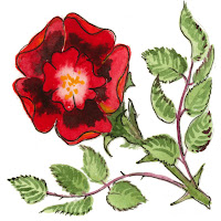
Last fall, having anticipated a need for pictures of floral elements, I had taken a number of photos from stems taken from a bunch of yellow roses. Now I worked with those pictures to assemble a variety of ‘Rose Stripe’ papers.

Some other papers I produced by photographing existing old wallpaper from the Victorian era and ‘restoring’ it by cleaning it up ~ in effect repainting an area of the paper, then re-assembling a page from the restored illustration.

As I proceeded, I began to learn new techniques, such as working with layers and textures. Ultimately I found myself able to build completely original paper designs that looked to me very professional. With a little more effort, I think we shall be able produce some finished papers which may be enjoyed for generations.


I have posted more pictures on my ‘Flickr’ photostream, showing aspects not illustrated here.

Sunday, February 6, 2011

Experimenting with a Different Style.


Here is a watercolour I have been working on. Not quite finished yet, so I am not posting it on Flickr just now. I am also putting in here a reference photo of the Japanese style garden which inspired me to do this picture, and an experimental try at Japanese writing. The writing attempt was done with a brush on the bark of the Kolkwitzia tree (otherwise known as 'Beauty Bush') I should have used a pen instead of a brush, and obviously, I should take lessons before I try such things.
I do not wish to explain this blog any further at the moment. It is here now specifically so someone can take a look and help me with it.

Tuesday, March 23, 2010

Painting and Printing Decorative Borders


For the last little while I have been immersing myself in family history again. This included printing up a couple of family trees as gifts. These printouts are getting quite big and were looking rather plain. I thought this time I’d like to decorate them with borders and flower motifs, rather like an illuminated manuscript. I guess I was thinking about that Book of Kells. With the miracle of computers and home printing I was able to accomplish this a lot quicker than the mediaeval monks; nowhere near as well of course, but I had a lot of fun with it. I was partly inspired to do this because I recently bought a large format printer and can now print up to 13 x 19 inches; so when building a tree I only have to glue together half the number of sheets as formerly.

I began by painting in watercolour a long narrow band of mixed tree leaves and fruits; some traditional species from the English woods of my boyhood. Holly, ivy, ash and oak. At this time of year I can’t bring in leafy oak and ash twigs, so I did those from memory, but we do have both holly and ivy growing in the garden, so I brought in bits of that to refer to. I made that band about 18 inches long so that it would print the entire length of a piece of 11 x 17 paper. Then I painted a corner section along the same lines. These border bands are 45mm (about 1¾ inches ) wide.


Then I painted five small stylized wildflowers to go into the various corners. In accordance with my ancestry, I chose the thistle for Scotland and the roses of Lancaster and York to represent those two counties. I don’t know whether Cornwall has a national flower; but I always think of daffodils in the springtime down that way, so I picked that. Lastly, to represent the southeast of England, Essex and Kent, I chose the English bluebell which used to grow abundantly close by where we lived.

I scanned in the results, and with some rather tricky and careful planning I managed to print the border elements onto the sheets upon which I had already printed the family tree data. It helps to be able to flip the border bands horizontally and vertically in Photoshop, and of course, rotate them as required. This not only fools the eye into thinking the pattern is not repetitive, but also assists in achieving a good matchup when ‘splicing’ one page to the next. By this means I was able to print fourteen running feet of border whilst only having to design and paint about three feet.

I have uploaded everything freely on Flickr as usual, so if you like to download the pieces and play around with them you can make printed frames as I did. These illustrations can of course easily be made to print smaller than I painted them. They will probably look even better that way. When you need to ‘splice’ two lengths of the band together, or a piece of band to the corner section, proceed as follows: when you are dragging one of the various pieces into a new ‘canvas’ for assembly, first select the white background of the piece (with a low tolerance, say 10). Then select ‘Inverse’. Your selection now consists of the entirety of the painted elements without the white background. Now drag it over with the ‘Move’ tool and overlay it onto a previous layer. It will appear ‘lacy’ – you can see through between the leaves and twigs to the layer beneath. This enables a perfectly natural splice which will be absolutely undetectable. Merge the visible layers when all is in place and you are satisfied.

Sunday, January 10, 2010

Freeing it Up: How I’m learning to paint differently


I have been provoked into trying some radical departures from my usual style of painting, which as you, my friends, know, is generally deliberate, tight, and detailed. This is all very well, but I do often yearn to achieve a lighter touch. So when Bill and Gerry set up the ‘Flickr’ group ‘Fast and Fabulous’ and invited me to join, I was hooked. If I had to force myself to complete a painting in half an hour there would be no question of employing habitual techniques.

So today I broke out of the mould and did it. Perhaps once or twice in my life I have painted something in less than three hours, (the odd Christmas card, for instance) but this effort, ‘The Niagara River at Brown’s Point’, was painted in 28 minutes. Wow, you sure have to keep the brush moving fast!

I learned a lot from this new approach, the first thing being that you really should choose a simple subject. It helped that I had decided on a snowy landscape. Snow allows you to omit a vast number of brushstrokes. The next thing is, that it is good to internalize your vision to the point where you know exactly what you want to put on the paper; there’s little time now for reference to other sources for inspiration or detail. Better that it is already fixed in the mind. A couple of weeks ago I was driving down the Niagara Parkway, a very familiar route, and as I passed Brown’s Point the striking view through the trees imprinted itself on my mind: a broken sky of pure cerulean, seen through a tracery of sepia branches; the river cobalt green, glimpsed through tall hardwood trunks, mostly maple; a scattering of underbrush amidst the clean, fresh snow. It’s not convenient to stop at that point on the Parkway, and being the driver I could allow myself only a brief glimpse. A week later though, I came this way again, prepared to clarify and reinforce my impression of the scene. With only another two or three seconds to take in the scene, I am trying to train my powers of observation; this is fun in itself, seeing how much you can remember from only a brief instant of study; like Kim’s game.

From this mental picture I was able to plan my ‘order of work’. I had thought of first reserving out some treetrunk highlights, perhaps with vertical slashes with a candle-end, but dismissed this as unnecessarily fussy. So first I must lay in the sky and some violet shadows in the snow, wet-in-wet After the paper dried I would paint in the far bank of the river in a colour close to W&N ‘Neutral Tint’. Then I must broad-brush the treetrunks in sepia and add branches and twigs, next adding the bright flashes of the river, then finally some underbrush in Burnt Sienna. Figuring this out did take some thought.

The matter of colour selection took additional planning that I don’t usually pay much attention to ahead of starting on the picture. Again, simplicity had to be the keynote – little time can be devoted to mixing subtle shades of colour. I decided I needed only five shades - Cerulean Blue, Windsor Violet, Neutral Tint (with slight admixture of Ivory Black), Cobalt Green and Burnt Sienna.

Again departing from my usual technique, I made no preliminary pencil sketch; I just made two tick marks at the side of the page to register where I wanted the horizon and the river to be. As I entered upon the painting I got my next lesson: mix the paint strongly enough to achieve the required tone in one stroke. No time to build up the picture with careful layers. Ouch. I’ll do better next time; promise. The next obvious matter to be addressed is brush technique. Normally, I build my shapes up carefully with fairly small brushes. No time for that now. Broad-brush is essential, at least in many areas. Which brings one quickly to the realization that wielding a broad brush properly has to be learned: achieving the desired shape of brushmark with correctly delineated edges has to be accomplished in one swipe. Oh dear; I have to work on that seriously. Then there’s a question of detail; at the very least, it must be suggested, else the scene appear bland and empty of interest. I learned in this little trial to get some small delicacy in the underbrush by first putting on a little patch of colour with a No.6 round. then quickly feathering out the top of the shape by dragging a dry fan brush through it. I’ve hardly ever used this brush before.

I feel great satisfaction as I contemplate this process. The actual result matters little compared to the pleasure of learning so much in such a short time. Discovering too, that I can in fact produce a worthwhile sketch in very limited time opens vistas of possibility. No longer daunted by thinking I must set aside half a day if I am to paint at all, I begin instead to enjoy the happy thought that maybe I can find thirty minutes each day, like ‘Linfrye’, and might look forward to improving my skills with more frequent practice.

All of which brings me to some final thoughts, which are of gratitude for the inspiration and encouragement I get from my artist friends on ‘Flickr’. Were I on this journey by myself it would be lonely and often disheartening. Having in addition outsiders, (and not only friends), approve of work about which I myself entertain serious doubts gives a balanced perspective. Seeing, if only dimly, through others eyes is interesting.

So much, to come out of so little. Wunderbar!