Friday, December 5, 2008

Exploring Grandfather's Paintbox - V


Chapter V

A FUTURE FOR THE PAINTBOX?

Well, there you have it. A leisurely tour through the painting kit of William Hall Henwood. I hope you have enjoyed it.

And now a question presents itself, which is, should I preserve this whole collection as I found it, as a memorial and heirloom to be passed on to my descendants, (should any of them show interest)? Or should I carefully, lovingly, renovate the box, install my own paints and brushes, and take it once more into the field. I have found some brass fittings that fit the castings where the legs screwed in. These same fittings would also fit into bamboo canes of about 9/16” outside diameter, which would make good, lightweight legs . (Or I could easily enough build telescoping legs out of hardwood which would be even better. I have a nice piece of cherry wood that has been waiting twenty-five years for the perfect little project.) There is a third option, difficult, time-consuming, but perhaps worth the effort. I could try to build a replica of the box. Without metal-working tools or the skill, I could not make an exact copy except at unjustifiable expense. I could make the box easily enough to the same size; same hinging, lid, handle and similar brass hooks to hold it closed. I could make it out of the same material as the original since I still have some pieces of walnut lying around, left over from the days when I made furniture for a hobby. But am I ever going to paint in oils en ‘plein air’? Somehow I doubt it.

Perhaps the best answer then, might be to make a walnut box of the same size and appearance simply to hold my oil paints in the studio. This would fill a need, whilst at the same time serving to remind me of the roots of my interest in painting. Tell me what you think.

Thanks, Grandfather.


IN MEMORIAM
WILLIAM HALL HENWOOD
1862-1939
SALVE ET VALE, AVUS

Thursday, December 4, 2008

Exploring Grandfather's Paintbox - IV


Chapter IV

THE BRUSHES


Grandfather was the eldest of six brothers and sisters. The only one of the six who was still alive as I grew to an age where I could remember was my great-uncle, Henry Thomas Henwood, the second youngest of the group. He too had made a career in the Bank, and he too was an artist. Having no living descendants himself, he took an interest in his great-nephews and nieces and in me particularly because I was already showing a liking for and some talent in art. When I was fourteen years old he gave me £5, that is, five pounds sterling, to buy myself a set of oil paints. “You should buy poppy oil” he cautioned me, “not linseed. That will yellow.” Five pounds was still a good sum of money in those days: it enabled me to buy a wooden box from Winsor & Newton, and fill it with a range of artist’s colours. A quality wooden palette, brushes, a clip-on double-dipper; all came out of that generous gift. That equipment today would cost several hundred dollars. Doesn’t that show the inflation we have undergone in the last fifty years! You can’t get a plate of fish and chips for five pounds today, (which, by the way, used to cost me one shilling and threepence (or fifteen cents) when I was a boy). But I digress again.

Uncle Henry invited me down to Devon to stay with him for a couple of weeks during the summer holidays that same year. By then he was a very old man, and in poor health. It was difficult for him to rouse himself, and he hardly stirred from his room. Consequently I spent many happy days rambling over the moors on the west edge of Dartmoor, which began at his doorstep. But he did show me a painting he was still working on, and demonstrated some techniques to help me along.

There is just one painting of his that has come down to me – an unfinished landscape of a meadow with cows in front of a ruined abbey. His painting style and brushwork was quite different from that of my grandfather. His cows are very good.

(But I see you are busy. I shouldn’t keep you so long. Let’s get back to the subject at hand.)

It should be remembered that the original intention of this piece was to make an inventory and catalogue of all the items in grandfather’s painting kit. I hope to be forgiven for doing this regardless of the near inevitability of boring the reader at this point.

There was a small selection of brushes in the central tray of the box. Here is what I found: (DSCN2853), (DSCN2240).

W&N Series 51 #0 Round, sable poor condition, but just usable
Rowney Series 101 #1 Round, sable no bristles remain
unknown unknown ca. #2 Long Flat, bristle poor cond. might be restored
Rowney Series 110 ca.#2 Short Flat, bristle excellent condition
W&N Series A #4 Round, bristle fair condition
W&N Series A #10 Round, bristle very good condition

I conclude that the excellent #2 Short Flat was a replacement for an earlier worn out brush, since it shows signs of light use and carries only one smear of paint on the handle – white.. When I examine my grandfather’s landscapes, it seems to me that this type and size of brush would probably have been used a lot for the trees and hills of the middle ground. I suppose the hairs on the #1 Sable had just disintegrated over time.
I was rather surprised to see the big, #10 Round. I suppose it was used mostly for underpainting the skies – the paint residues on the ferrule and handle are mostly blue and white. Residues on the #2 Long Flat show greens, browns, red and orange, indicating use on trees, grasses and buildings. The #4 Round shows traces of Venetian Red, Yellow Ochre, Raw Umber, and some greens

I am thinking about taking the two best of these brushes back into use.

Wednesday, December 3, 2008

Exploring Grandfather's Paintbox - III


Chapter III


THE COLOURS


Grandfather had a sure eye for tone and colour. Astonishingly to me, even his early paintings show this ability and confidence. It was not until I myself resumed painting seriously that I began to appreciate just how good a landscape artist he was. A study of his paintings reveals a wealth of the subtle greens and golds, misty blues and purples so typical of the English landscape. He understood the light. Look carefully at any of his paintings and you can see the time of day, and the season of the year. He was not shy to use warm tones of orange and ochre in the foreground to evoke a hot summer day. Long shadows, salmon tinged clouds and purple haze bring to life a late afternoon in the meadows. Yet the colours in his scenes are always harmonious, never garish, the shades gently muted as they are in life in the higher latitudes of temperate northern Europe. In those days before the advent of universal (now virtually free) colour photography it cannot have been easy to capture the moment. Both observation and memory would have to be practiced and honed. In the old days I myself used to do a quick pencil sketch of a scene and cover it with scribbled notes as to hue and tone. Now I take a dozen reference photos instead, but I’m not sure that is better.


So let us talk about colour. In Grandpa’s paintbox are twenty-seven old tubes of paint. These are in three different sizes, all fairly small compared with those commonly sold today. The lead tubes are either two, three or four inches long, and have a uniform diameter of approximately half an inch. The smallest weighs about twelve grams or half an ounce when full, the next about 18 grams, and the largest perhaps 25 grams. At a guess, the tubes hold about 5ml, 10ml and 15ml respectively.
I decided to see if I could sample each of the paints and make a colour chart. I did ultimately manage to accomplish this (Grandfather’s Paint Colours), but it was a lot easier said than done. Naturally, after a lapse of seventy years, the tubes would be a little reluctant to yield their secrets. Surprisingly, some did actually open for me without resistance, but most of the caps needed very careful but firm persuasion before they would unscrew. I devised a method of gripping the tube in a curve-jawed visegrip after first wrapping the body of the tube in several layers of cloth. Then I used a pair of small pliers to unscrew the cap. That worked in a lot of instances, but some tubes were so fragile that they started to tear apart under the twisting strain. In these cases, and in those where I found the paint to be hardened to the point where it wouldn’t squeeze out, I sampled the paint by drilling into the tube (when possible through the neck) with a 9/64” twist bit. This gave me a paint sample in the threads of the drill bit. In cases where the paint was really hard I would then grind the paint in turpentine on a ceramic palette using a round-headed siding nail. In a few cases, the paint seemed quite miraculously fresh, only the label betraying the signs of age. Ultimately I was able to retrieve pigment from every tube. Virtually every colour seems to me still to demonstrate the original hue, with one exception – I am not sure whether perhaps the Aureolin has changed colour over the years. This is not a colour I am familiar with, but I did not expect it to show as such a muddy greenish yellow.

The colours I found in the box make an interesting list. Many of the labels have names I have never encountered before. This is not surprising. With the great strides in chemistry over the last decades there have been concomitant huge developments in the pigments offered to artists. Perhaps the pace has been especially rapid because so many paints used in the past were based on highly toxic compounds. Others were made from rare and expensive substances like the semi-precious stone Lapis lazuli .

I went to the Web to look up some of the unfamiliar names. After many hours of research I found what is (to me) the single best resource for this task of investigating obsolete artists’ colours. That source is “Field’s Chromatography”, edited by Thomas Salter. This treatise was apparently first published in Paris around 1830, then revised and published in English in 1869. I will refer to it below simply as ‘Salter’. It is available freely in its entirety as an ‘e-book’ , courtesy of the Gutenberg Project. What a gift! I also came across the modern equivalent entitled ‘The Pigment Compendium’ by Nicholas Eastaugh et al. The Web provided excerpts only of that one. Both these books are available, but the price of the second one might give a bit of a shock!

But before I discovered 'Salter’ I had already dug up a lot of information, often contradictory. For instance, I started my search by looking up ‘Veronese Green’. -

Veronese Green. What a nice, earthy natural sounding Italian name, I thought. On the very first page studied I found – ‘Veronese Green: Brighter and bluer than Cadmium Green. Favored by the French Impressionists. The original, no longer made, was arsenic based and very toxic.’ (source: rfpaints.com) O... K….so we know why that one is no longer on the charts! But here I went down the wrong path and confused myself, by jumping to the erroneous conclusion that Verona Green was the same thing as Veronese Green. Not so. Verona Green, otherwise known as Terre Verte, or ‘Green Earth’ - ‘ is collected by mining. The most famous and "best" deposit of terre verte could be found near Verona, Italy, and this mine was functional until World War II’. Here is another interesting web page : http://www.sewanee.edu/Chem/Chem&Art/Detail_Pages/Pigments/Green_Earth
Here we are told that this pigment is composed of celadonite and glauconite. Both of these minerals are of the mica group. Terre Verte, the natural earth is still available as an oil and watercolour pigment. Winsor and Newton list their Terre Verte as being– Hydrated Chromium Oxide. So Veronese Green and Verona Green (Terre Verte) are quite different in both colour and composition. The latter is a weak earth colour, a lot less vivid than the Veronese Green discovered in Grandfather’s paintbox, which is close to Viridian, as mentioned in ‘Salter’. - (Veronese Green) or French Veronese Green, is a comparatively recent introduction, similar in colour and general properties to the following (referring to Viridian); beside which, however, it appears dull, muddy, and impure. It is often adulterated with arsenic to an enormous extent, which interferes with its transparency,mars its beauty, and renders it of course rankly poisonous.”

I guess I need a chemist to tell me if I have the arsenic variety!

This detective work begins to take a grip on you. There is a certain fascination in finding a way through all the leads, some false, to arrive at a firm and correct understanding of a pigment; something which you would expect to be simple and straightforward but often turns out exceedingly complicated and perhaps with no firm resolution at all!

The next colour I researched proved more tractable. In this case, ‘Salter’ was no help, as the pigment was only discovered in the twentieth century:
Monastral Blue:
‘A final example (of a serendipitous discovery) occurred in 1928 in Scotland. A.G. Dandridge was operating a chemical plant that produced phthalimide from ammonia and molten phthalic anhydride. Since the temperatures were quite high, the reaction was performed in a large iron sealed container. Dandridge noticed some strange blue crystals on the cover and sides of the container and was curious enough to collect some for examination. he discovered that they resulted from a reaction between the iron container and the contents. Further study found the chemical structure of the pigments and he named them phthalcyanines. By substituting copper for iron, he produced an even better pigment called 'monastral blue'. This family of pigments, which have resulted in over thirty patents, have become some of the most valuable coloring materials for paints, lacquers and printing inks.’ (source: The Bakken Library [ww.bakken.org]}.

That colour then, was a brand new invention at the time my grandfather was painting.

Next I tracked the Vermilions. Winsor & Newton list Vermilion as - ‘Obsolete’ and now offer ‘Vermilion Hue’. I should dearly love to quote ‘Salter’ at full length on this one, but if I start to do that this blog will end up as a book, and mostly plagiarized at that; but I cannot resist giving you his closing paragraph on the colour:

‘ … vermilion is not so much adulterated as it once was; although, even now, brickdust, orpiment, &c. sometimes sophisticate it. The knavish practices to which the pigment has been subjected, have acquired it an ill-fame both with authors and artists. Vermilion has been charged with fading in the light, and with being blackened by impure air; but it was the custom to crimson the colour by means of lake, or tone it to a scarlet hue by red lead. With pigments as with persons, evil communications corrupt good manners—a motto that might be written with advantage on every palette.’

Scarlet Vermilion: is (technically) the compound Mercury Sulphide (HgS). We all know nowadays that mercury is bad news, so no wonder I cannot find it offered as an artist’s colour.
‘Salter’ says: Resembles the preceding (Vermilion) in all respects, except in being more scarlet in its tint, and washing better; advantages which render it more useful when the tone is required to be very bright and pure. At one time, the Dutch alone in Europe possessed the secret of giving to vermilion a rich scarlet colour.


Prussian Brown sounded interesting - ‘Prussian brown is a good and permanent colour made by calcining Prussian blue. It is a very transparent iron brown of a yellowish hue. An-other form of Prussian brown is prepared from a solution of blue copperas added to a solution of yellow prussiate of potash. This is a copper brown’: http://www.oldandsold.com/articles20/painting-methods-13.shtml
I found a very pretty story about how to make Prussian Brown on the website -http://www.pigment.ca/Chromatography/French-Prussian-brown.html
‘According to Bouvier, a colour similar to that of bistre, and rivallingasphaltum in transparency, is produced by partially charring amoderately dark Prussian blue; neither one too intense, which gives aheavy and opaque brownish-red, nor one too aluminous and bright, whichyields a feeble and yellowish tint. Yielding to a rapture we cannotwholly share, he describes its qualities in the warmest terms. In hisopinion, it has the combined advantages of asphaltum, mummy, and rawSienna, without their drawbacks. "I cannot," he says, "commend toohighly the use of this charming bistre-tint: it is as beautiful and goodin water as in oil, perfectly transparent, of a most harmonious tone,and dries better than any other colour suitable for glazing. Closelyresembling asphaltum in tint as well as in transparency, this brown ispreferable to it in every point of view." As the colour is very quicklyand easily obtained, the artist can judge for himself of its propervalue. M. Bouvier's process is, to place upon a clear fire a large ironspoon, into which, when red hot, some pieces of the Prussian blue areput about the size of a small nut: these soon begin to crackle, andthrow off scales in proportion as they grow hot. The spoon is thenremoved, and allowed to cool: if suffered to remain too long on thefire, the right colour will not be produced. When the product is crushedsmall, some of it will be found blackish, and the rest of a yellowishbrown: this is quite as it should be. Chemically, the result is amixture of oxide of iron and partly undecomposed or carbonisedprussiate’.
Doesn’t that sound like fun?

Bouvier, cited above, was I believe the original French author (or originator) in about 1827 of the work later translated as ‘Field’s Chromatography’. On p.310 of ‘The Pigment Compendium’ by Nicholas Eastaugh et al. there are a number of instructions and directions given for how to make Prussian Brown, with references ranging from 1827 to 1906.

Ultra. Ash #2. This little tube intrigued me because, in brackets, it said ‘Lapis lazuli’., which is a semi-precious stone. ‘Answers.com’ says Ultramarine Ash is ‘The residue of lapis lazuli after the ultramarine has been extracted; used as a pigment in paints’. Emma Pearce, in her book ‘Artists’ Materials’ says only that this is ‘poor quality Lapis lazuli’. The sample I recovered from the tube (see chart), proved to be a grey of a slightly greenish-blue cast; quite interesting, and different from anything I can see on the W&N chart today. The ‘freedictionary.com’ says –

‘(Paint.) a pigment which is the residuum of lapis lazuli after the ultramarine has been extracted. It was used by the old masters as a middle or neutral tint for flesh, skies, and draperies, being of a purer and tenderer gray than that produced by the mixture of more positive colors.
- Fairholt
.’
‘Salter’ gives an even more poetic description of this colour.

Fascinating. So lastly, I searched for - Mineral Gray, since that also stated on the label that it was ‘Lapis lazuli’.

Mineral Gray which turns out to be an even lower derivative of the stone, obtained after all the blue and ash have been worked out. The sample I have shows a purely neutral grey. So much for the rare and expensive substance! Last of all the unfamiliar colours, I came to -

Verona Brown
‘a pigment peculiar to oil painting, is a native ferruginous earth. A citrine brown of great service in tender drab greens, it forms with terre verte and the madder lakes rich autumnal tints of much beauty and permanence’ – Salter.

In addition to the archaic colours investigated above, Grandfather had the following tubes, which are mostly more familiar:

Antwerp Blue
Aureolin
Burnt Umber
Cadmium Green
Cerulean Blue
Charcoal Gray
Cobalt Magenta
Cobalt Violet
Extra Madder Carmine
French Ultramarine
Indian Red
Ivory Black
Purple Madder
Raw Sienna
Raw Umber
Rose Madder
Venetian Red

I find the total selection provokes some questions. Why such depth in the range of Madders and Browns? Two Verona Browns?, plus Raw Umber which is oh, so similar? and yet another (unlabelled) Mid Brown? What with the Cobalt Violet, the Cobalt Magenta and the three Madders, there are no less than five hues in the red-purple range. But the selection was thin in the blue section. No Cobalt Blue? For me that is an absolute must! How was it that he bought no less than three very close orange/scarlets? Why no yellows apart from the Aureolin? No Yellow Ochre? No Chrome or Cadmium Yellow? Grandfather certainly used plenty of this type of hue in his paintings, so perhaps he had just run out. And there were no whites either.

From my exploration of these colours and their history on the Web I learned some interesting things about the development and use of pigments. Moreover, it really brought home to me what a hugely valuable resource we have now at our fingertips on the Internet. Rare books, documents and studies from scientists and libraries around the world. How marvelous that we live in a new age of enlightenment, where such previously arcane knowledge is now freely available to all.

Tuesday, December 2, 2008

Exploring Grandfather's Paintbox - II


Chapter II

THE PAINTBOX

One day about thirty years ago my father took me to see his boyhood haunts. He led me around the ponds and woods and quiet suburbs until we came to the house where he had been born. He noted that the low wall along which he used to run as a child was still there. As he pointed to an intersection a few houses down the street he told me how he used to watch as his father left for work in the mornings. ‘I remember my father’, said he, ‘swinging round that corner in his top hat and tail coat, on his way to work’, striding down to the station to catch his train to the city. In those days suburban living and the middle class were comparatively new developments, resulting very much from the rapid spread of the railways, which had penetrated every part of the country over the previous fifty years. Now people could live in the leafy edges of the metropolis and yet still work in the very heart of the city.
I have come to understand that my grandfather had a love for the countryside, which may account for why he chose to spend a great portion of his retirement in the field, painting. He was a religious man, close to his God. He was a long time member of the London Banks Christian Union, one of the dozen men who made up its general Committee, and for twenty-two years he served as Joint Secretary of that Union. In a letter he wrote in 1936 to one of his sons, my uncle, he commented that – ‘I have sometimes consciously received help when out in the country, all by myself & I have seemed to hear the Still small voice in a way not realized at other times’. He went on to say – ‘We need to realize more how entirely we belong to GOD – we and all we possess, or all those talents of which He has made us steward & for the use of which we shall one day give account.’ Such a faith, which, (do I regret?), I cannot share.

But let us now turn our attention to the paintbox. First glance at this remarkable article shows that it is of the highest quality: It is made of neatly dovetailed solid walnut, with brass fittings. Overall the box is 40cm long, by 29.5cm wide and 8.5cm in depth, that is roughly 16x11.5x3.5 inches. Three brass butt hinges fasten the lid at the back. At the front a pair of small hooks hold it closed, and to carry the box there is a flat leather strap handle, now decayed and broken. In addition there are three fairly heavy brass castings mounted on the outside of this box, one on the lower edge at front centre, and one at each lower back corner. These fittings are threaded, and a trial showed that they accept a three-eighth inch outside diameter coarse thread (12 per inch). So the box is designed for three legs to be screwed in from underneath to support it at a convenient height in the field. The back corner fittings are designed so that the legs angle outwards at about 15 degrees. From the centre front fitting the leg drops vertically, the whole arrangement making a stable tripod. The legs are missing.

When opened, the lid of the box is held in position by a brass strap housed in the left side of the box, which hooks in variably at the lid end to provide a range of working angles for the built-in easel, which is fitted into the lid itself. This easel can hold two panels at once, one behind the other, within the depth of the lid. Panels up to fourteen inches in width and ten inches high can be accommodated, and by means of a sliding adjustment of the easel frame smaller pieces may be held, down to as little as seven and a half inches in width. Two panels (of the same size) may be easily worked on and transported home, even when still wet.

The first thing to be seen, snugly fitting in the main box, is Grandfather’s palette. At 14¾ x 10⅝ inches, rectangular, this is just barely within the inside dimensions of the box. It is made of a thin panel of solid walnut, the thumbhole cut for a right-handed artist. It isn’t dirty or crusted with old paint, though upon it there are indeed still remnants of the paints last used.. Remembering how many paintings it helped to make, it is clear the owner took good care of it. I have now put this palette back into use, lefthanded, so the surface I am using is relatively clean.
Setting aside the palette reveals an interior sectioned by neatly made tin liners. There are compartments for brushes and tubes of paint, and included also are both a small single dipper to clip onto the palette, and a little screw-topped tin can to hold medium or turpentine.
Altogether an ingenious and convenient setup, well designed for the field.

Monday, December 1, 2008

Exploring Grandfather's Paintbox. I


A Story in Five Chapters, illustrated on ‘Flickr’.

Chapter I

PRELUDE

I opened a nearly full tube of Winsor & Newton Artist’s Oil Colour. It was a small tube of Scarlet Vermillion. Under the cap the threads were quite clean and a gleam of oil winked from the neck of the tube. I squeezed a little onto the brush, where it lay fresh, smooth and brilliant. It gave me the oddest feeling; as if the paint had been waiting for me. Waiting.

I travelled back in time recently - to nineteen thirty-eight. Not so long ago, not so far away; still in living memory, just. Far enough away and long ago to me though, for I had not been born yet.

Let me explain. A few years ago I was privileged and delighted to find myself in possession of my father’s father’s paintbox. I had not even been aware that Grandfather Henwood’s painting kit still existed until it was shown one day to my sister, who was visiting our cousin in Ireland. They thought that perhaps I would like to be the custodian of this artefact from our family history, and so it was brought to me. I was able to see and touch the paints and brushes my ancestor had used. This had great significance to me, because I never knew my paternal grandfather. He departed this world shortly before I arrived in it. Now I felt in contact with him.

I know my family’s history, so William Hall Henwood is not a stranger to me. He was born in the middle of the nineteenth century, and at the age of fifteen he went to work in the Bank. That was not an early age to start employment in those days – my other grandfather began working at the age of twelve; but that is another story. “He should really have gone into the Church” my father mused one day, but instead Grandfather Henwood served faithfully in the Bank for forty-nine years and five months, finally retiring in nineteen twenty-six at the age of sixty-five .

According to my father, he then invested in a dozen art lessons and promptly began to paint. Over the next twelve years he painted (as far as I can estimate) probably about fifty pictures. He painted in oils, mostly on wood panels, though occasionally on canvas boards too. His interest was the English landscape, and from the paintings that I and other close family members own or have seen, he painted chiefly from the countryside round about where he had lived most of his life, the area of northern Essex; the woods, ponds and gently rolling country where lies Epping Forest. His paintings were uniformly small, ten by fourteen inches. After coming into possession of his paintbox I came to realize that this size was a function of the box, which was a travelling kit, designed to be taken into the field.

I decided to thoroughly study this fascinating artefact and family heirloom, and when I did so I discovered there was more to it than immediately met the eye. That gave me the idea of writing down a full inventory and description of what I had found. But as I gradually spent more time investigating the box and its contents, my thoughts began to range wider. And when I dug out and re-read some treasured old letters which have come down to me, and reviewed once more the course of my grandfather’s life, I began to understand him better. So this story could also be called, if you like, - ‘A Tour around my Grandfather’.

Sunday, November 30, 2008

Grandfather's Paintbox; an Introduction.


I have a little story to tell. It is about my grandfather who, in retirement, was a landscape painter. I shall be putting the story on my blog over the next few days. Mainly, it concerns an exploration of something he left behind – his paintbox. I have very much enjoyed examining the paints, brushes and other equipment, along with the box itself, which is a beautifully designed and constructed artefact. All has lain unused for seventy years, and recently came into my care. I have taken a number of photos showing some of the intricacies of the paintbox, with its built-in easel, and in my account I have explained how I sampled all the paint colours which the box still contained. I hope all this may prove interesting to my artist friends, especially those with a fondness for the history of paint and artist’s equipment.
The story is in five parts. Some of the technical bits about historical colours you may find boring, so feel free to fast-forward. On the other hand, I’ve buried a few quotations there that you might find amusing too!
The story will be illustrated on Flickr. You will find the associated photos together in a set entitled ‘Grandfather’s Paintbox’. It is in tribute to, and appreciation of my grandfather, William Hall Henwood.
Here is the link to Flickr:

Friday, November 28, 2008

Realizing the Vision - or Not!


I have yet to do a painting where I was not first absolutely gripped by the subject. Often I find myself returning to the real world scene to study what it is that I find so exciting about it. There is always some kind of idealized vision in my mind that I need to express, something that is different from what you might call the ‘actuality’, that a camera might see. It may be simply the combination of colours which first attracts, or there may be an emotional context that needs to be memorialized. Sometimes it will be something that startles me visually, that I have never noticed before in life. In some cases the vision is only in memory, the source being now inaccessible or long in the past. When I find my thoughts often recurring to any theme I will put it on my list – of ‘Paintings to Do’! The list gets ever longer, as more pictures get undertaken in the heat of the moment without ever going on the list. But I digress.

Last Sunday I painted a landscape that made me really happy. It did not take very long, and it was a true success (for me at least), because it did in fact simply realize the vision, perhaps with only a tenuous relationship remaining to the original source which inspired me. I’m talking about my little landscape ‘Dawn Breaks over the Gumligenberg’, which I have posted on Flickr. It is amazing how such a happy, albeit simple result can give confidence, (regardless of the opinion of others), and confirm a novice artist in the belief that he or she does indeed have something to offer.

So, funnily enough, this event led me to take a long hard look at one of my paintings which I am least happy with. I find myself at the artistic point now where I think I need not hide my failures. Knowing that I can do, and have done better, I am ready for Critique, with a capital ‘C’. And the reason I want this is because, in connection with the picture I am unhappy with, I have never been able to exactly analyze what is wrong with it. If I can’t figure that out properly, then I may well repeat the same mistakes in the future.

I have to tell you now about the picture, called 'Aidan House' which is a watercolour of a neighbour’s house that I painted some three years ago. It wasn’t a commission; I did it because I was elated by the view of this pretty house all decked in fresh spring colours. The vision was all greens and yellows, cream and black; a bright spring morning with the trees newly leafed. A laburnum tree in flower in the front yard summarized exactly the fresh and happy scene. I cannot say the work went easily, and that should have been a warning sign. Because it was primarily a portrait of a house, I first took exquisite care over perspective and line in the drawing, before ever I dipped a brush into paint. When I was finished I showed it to my surprised neighbour, who was really pleased. So I gave her a framed print; kept the original, which I framed also. It has been hanging on my studio wall ever since, and is beginning to reproach me with its deficiencies.

So what I would really like is for a few honest artists to tell me where I have erred, and what they might have done differently, or even how I might have fixed the painting as it progressed.


I am about to join one or more of the ‘Art Critique’ groups on Flickr, and so I went in to a ‘Pool’ or two to see what I might expect in the way of comments. I have to say I am disappointed. I found that when I click on a picture that I consider poor, it is likely that, rather than offer hurt, people will not have commented at all! Nobody is going to learn from that. Conversely, when a work is good, comments are often just too effusive, whilst not actually offering any analysis as to why the picture in question is so outstanding. Again, while we all welcome the warmth of praise, there is not much learning to be had.

So here we go – I am posting this picture, which I already know is overworked and stiff. It reminds me of some kind of illustration done for a real estate ad. There, that’s my ‘off the top’ critique. Now it’s your turn. I’ve taken off my glasses. Take your best shot!

Friday, September 5, 2008

A Couple of Weeks Study at the Flickr School of Fine Art.


It was August. It was all tomatoes, all the time. I was eating so many of them that I was dreaming about them. I woke in the night and thought about them. Pure delight, not only for the tastebuds, but for the eye too; and I don’t mean just the fruit. Sturdy vines snake upwards, branching at odd angles, helped here and there by a little support from bamboo stakes. Such beautiful shades of green in leaf and stem. Such interesting compound leaves; each little leaflet different, seeming to have a mind of its own; some large and deeply toothed, others small and rounded. Reaching up, trailing down; heading in all directions in happy chaos. What wonderful patterns of light and shade to be seen in the tangled jungly growth. Spherical glows of gold, orange and red peeking through the gaps. Unripe green globes hidden deep, awaiting their turn. I could sit and look at them for hours. In fact, I did sit and look at them for hours, since for the last many days I have been absorbed in trying to capture them in watercolours.

I wanted to keep in mind some of the lessons that ‘Gilmopix’ had tried to teach me: work with transparent colours, mix up your darks, learn to mix colours more from a limited palette. I started off doing a traditional landscape; well, gardenscape. That is, I drew the whole tomato patch with its regular ranks, in context; the context being our crowded little vegetable patch with the wheelbarrow leaning up hard by against the red-painted picket fence, the compost bin squeezed in on the left, retaining curbs and pathway in front. Behind this, (all too close) rises a huge multi-trunked maple tree. It’s a wonder we get any tomatoes at all, yet they seem to thrive here each year.

Before I had this little painting finished, I was dissatisfied. It was a nice scene, but a bit busy. The eye was pulled this way and that, along the fence all the way to one side, and back again. The sketch was full of potential interest, but perhaps unfocused, lacking a real focal point. Had I so quickly forgotten to incorporate “Gilmopix’s” excellent thoughts on how to place a centre of interest? I thought my rendering of the tomato plants a little hasty and slapdash too. I hadn’t really captured the leaves properly at all. I finished it off and thought about it. It didn’t actually look too bad, but quite soon the chief mistake struck me: I had painted what I saw, instead of my vision. Basic; elementary. But then, that’s where I am in my painting: learning some pretty basic lessons. Cursed with an analytic mind, I jotted down and counted up all the different elements in my picture. I made a total of eighteen definably different parts of the picture. I then turned my attention to my vision – what had I wanted to capture? Tomatoes – vines – leaves – stakes – fence. Five elements. All the rest was superfluous, much of it totally irrelevant. There was another thing I noticed too: the work lacked tonal punch where it mattered most – in the tomato patch. As an experiment I opened the scanned image in Photoshop and threw away the colour. In greyscale the central area of the picture now had little meaning: no proper leaves were discernable, and even the tomato fruits were irregular and hard to find.

I decided to take a little lesson from my Flickr friend, ‘Ciuccio51’. I ran off a print of the image, took a fine permanent ink pen and carefully outlined everything as far back as the fence. I added inked detail to the curbs and made a half-hearted attempt to draw some real leaves. The result was, in my mind, considerably better: the fruit now highlighted; everything in the foreground a little crisper, the background now in softer focus by comparison. I quite liked it.

But I decided I needed to start on a new tack, incorporating the lessons I had learned. I thought that this time I should begin with wet-in-wet, establish some bright fruits and lots of green wash. I wanted to take a lesson from ‘bevmorgan’, and try to achieve a good effect with negative painting upon flowing washes. I got the washes down – bright lemon, green, a little pink. I got that far and then I had to stop. I didn’t feel at all ready for the next stage. Actually, I don’t think I had been ready for the first stage. Too hasty; insufficient planning. Never mind; press on.


But now I thought perhaps I should do a tonal study first, so as to concentrate on a proper composition of the key elements, and to achieve a better representation of the leaves and fruit, without having to worry about colour at the same time. I had never done a tonal study before, but had come across the concept in some of my books on painting technique. I blocked out a very rough bare-bones sketch, outlining only a few tomato fruits, a stake, a couple of vine stems, and a suggestion of the fence. I wanted to try to draw more with the brush this time, rather than filling inside pencil lines with paint. I finally paid enough attention to the actual plants before me. I started painting leaves, and they really did look quite tomatoey. The whole thing came together fairly well, with the fun part being filling in the dark negative areas. I finished off with a thin wash of colour on the fruits only, which I thought set it off nicely. I learned more lessons on this one too: make sure you have a really really smooth curve on the outside of the tomato! Or they will end up looking more like potatoes. Oops! And don’t be careless with perspective on the fence, thinking that so little shows that it doesn’t matter. Amazing how the eye reads tiny discrepancies and says -“Wrong”.

I thought some more. I spent some productive time when I woke the next night: I put in an interesting hour or so meditating on how best to proceed with the colour version. It was too late to reserve any areas out, unless I wanted to begin again, so I had to come up with some order of work which would ensure a good composition. That did take some puzzling out. Obviously, I would first need to do a light pencil sketch over the existing washes. But what next? I came to the conclusion that the visible parts of the red fence should be put in first, because the colour here is so striking, that if I didn’t get a good balance of this right away I might lose it and be constrained later by the overabundance of vegetation. I worked out a sequence for the other parts of the picture and fell contentedly back to sleep.

Next day I was ready, eager and confident to get to work and see if the plan would work. I made a light sketch, taking special care over the alignment of fence parts and a proper angle for shadows on the exposed bits of earth. I very carefully outlined the tomatoes. Boy, is it ever hard to get a fair curve all the way around a fuzzy patch of yellow wash! Then I laid in some red on the visible bits of fence, to give a sense of where I was going. I tried with limited success to wash out the colour from where I wanted the bamboo stakes and put some colour there too. Hmm; would have been better to reserve that out in the first place. Now I was ready to paint the vegetation. It all went along pretty well after that.

I’m reasonably pleased with the result. There are lots of things about it to be dissatisfied with of course. No need to point them all out. I know that you, my teachers will recognize the deficiencies. I know too, that you will also be too kind to point them out, except upon request. That is as it should be, otherwise it could become just too discouraging. I’m still at the stage where I recognize enough flaws in each effort that I really don’t need any more pointed out at the moment. But I am thinking that that will have to change one day. If I ever get to the point where I think I’ve got it right, I’ll let you know – then you can all set me straight!

Thanks to all of you. I have mentioned only three of you in this little essay, but the rest of you know who you are. I am learning from all of you; all my teachers in the Flickr School of Fine Art.

That was a nice couple of weeks.

Saturday, August 2, 2008

A Different Approach with some 'Flickr' Postings


Whilst on holiday in Switzerland recently we enjoyed a wonderful mountain walk above Lauterbrünnen, and towards the end of the day, as we took the train from Kleine Scheidegg back down into the valley, we stopped off in the village of Wengen. We were browsing in a gift shop there when my attention was caught by some items in the postcard rack. There they had a number of fascinating reproductions of early Swiss travel posters. The originals dated from anywhere between the 1880s to the 1940s. I quickly selected eight or ten as souvenirs, mostly choosing those that illustrated places we had ourselves visited.

But there was one that I chose, not for location, but for the subject. I knew I had seen it before, in an old album of my father’s. It was a picture of an early Postbus, full of people, making its way along a mountain road with a background of lake and mountains. On the reverse of the card was mentioned that the poster itself was originally published around 1925.

And here is the personal link. In 1923 my father went on holiday to Switzerland, and being already a keen amateur photographer, he took a number of photos of his travels. He spent some time in the area of Montreux, (where he recorded a visit to Chateau Chillon), and ventured as far south as the St. Bernard Pass. He apparently travelled with a group, and one day they went by motor coach from Aigle to the Col du Pillon. On the way back their vehicle overturned on the way back down. Looking at the photo, one would imagine there must have been injuries, but this is not mentioned in the caption. All this I have gathered from the sequence of photos my father left, as I do not remember ever discussing with him his early travels; an omission I sorely regret today.

You may see from a comparison of the ‘Alpenposten’ poster and the photo my father took of the wreck of his tour bus, that the buses are very similar (though not identical) in design.

So now I have added a brightly coloured postcard to the family history revealed in the old sepia photographs. I intend to juxtapose some more old and new pictures to Flickr, which I hope will prove interesting. And if anyone can recognize anything in the old pictures, be it location, or make of vehicle, an interesting mode of dress, or any clue which might enrich the limited descriptions I am able to give, I shall be most happy to hear your comments.

Sunday, July 13, 2008

You again?

Woke up last night in the wee small hours. Lay there awhile, floating on the black sea of Unthink. Listening. Was it a car door? Voices? An early squirrel scrambling across the shingles? Tried to hear through the white noise of high frequency tinnitus for a signal. Got the regular surf of the blood coursing up next to my ears. Whoosh, whoosh, whoosh. Sixty a minute. Supposed to be rain tonight. Not yet. Nothing.

Listening again. Not with the ears this time. With the mind. Don’t need to go to the bathroom. What then?

Oh.

So it’s you. For fifty years I hardly knew you. Sure, we’d met. I found you interesting, at first. But then, you didn’t stay long. Funny really, when I think back to the time when it seemed you added a certain frisson to existence; I used you to embroider the odd short story of my life. Added a little piquancy. That was then. Get a little tired of your company these days. I’ve noticed your moods. I used to think that if I understood you better we might get along. I might adjust, learn to live quietly in your company. After all, even the unwanted guest has to be accommodated; somehow. Not that easy really. Why do you come now? I knew you would, but I’m never really expecting you. It seems an odd time to visit; but I’m learning; you have your schedule. Just when I thought I was getting a good rest.

Hello, pain.

Tuesday, July 8, 2008

Wildflowers, and the Perils of Identification thereof.


Just recently I was so powerfully affected by the beauty of the flowers in bloom in a wild meadow nearby, that I thought to myself - it's not too late, I should at long last take the time to find out some of the names of these little gems of nature. One of the loveliest was a little yellow flower, growing in great profusion and blanketing wide areas of the field. It was only when I got down on my knees for a really close look that I recognized the true wonder it offered. The flowers were borne in fat clusters about six inches long; but the individual florets were the tiniest things imaginable. Four of the smallest petals I have ever seen formed a tiny gold star, with room in the middle for just a couple of stamens, which somehow looked out of scale. There must be thousands of these florets on each cluster. The leaves of the plant were alike beautiful in their delicacy and brillian green colour. Little whorls of needlelike leaflets grew symetrically around the stem, and from the whorl another little stem would grow.

I came back to the meadow again and again. I took photos, I brought home samples of this and other plants. I went to my bookshelf and took down the long-unused Audubon Field Guide to North American Wildflowers, confidently expecting to find the flowers I sought clearly and unambiguously described and illustrated. Then I could properly title the pictures I had uploaded to 'Flickr'.

Ah, if only nature was so simple! To my astonishment, there appeared to be no flower in the manual that matched what I had. Despite diligent searching, I was reduced to calling this "Yellow Wildflower 1". I broadened my investigation. Surely, thought I, with all the millions of pictures on Flickr, someone will have illustrated my little beauty? Well yes; the pictures are indeed there, but they only come up if you already know the name, which, uh, didn't work for me at that time. Searching on "yellow, wildflower, cluster" didn't bring up a match. Not to be thwarted, I next searched for groups: two great groups for wildflowers came up on page one. And here a little serendipity came in. In the course of my search I also came upon a group called "ID Please". What a Godsend. Adherents of this group delight in the puzzle of identification, and within 24 hours of posting a photo of my treasure to the group I had my answer. The flower is called "Lady's Bedstraw" or 'Galium verum' to use its official moniker.

Or is it? It turns out there are possibly hundreds of species of 'Galium', and scores of Bedstraws within the group. I Googled. I Wikipeded. I have examined as many species as I can find, and there seem to be no similar candidates. Why take all this trouble? Because the yellow Lady's Bedstraw is apparently not supposed to live in Canada. It is European. It does not feature in the ROM Field Guide to Wildflowers of Ontario, which I have just taken out from the library.

Which raises the question - is this in fact the European flower, brought accidentally or intentionally to Canada? Or is it some rare variety too uncommon to have been included in the standard texts? I rather lean to the first option. Especially as this field is right next to Fort George, one of the first places in the area inhabited by Europeans. Did they bring mattresses? Did they shake out the old stuffing and unwittingly liberate seeds here. Or did some thoughtful immigrant carefully gather some seeds to bring, thinking not only how useful this plant would be, but how comforting it might be to have this reminder of home?

Where was I? Oh yes, put a name on a flower. Done that.

Saturday, July 5, 2008

The Meadow on the Commons


Last week I took my bike out and started riding out again, down the Niagara Parkway path. This pathway begins just at the east edge of town, and closely skirting Fort George, heads east to the river. The very first stretch of this route passes across the Commons just south of Fort George. The Commons consists of some hundreds of acres of field and woodland. The part that is now open grassland was used for decades as a military encampment, but now lies quiet, except for the odd equestrian event or military re-enactment. Most of the grassland is mown a few times a year, but a patch bordering the woodland towards the river has been left as a natural meadow. As I passed by early last week, I was struck by the wonderful display of wildflowers. The growth was riotous. There were great swathes of different species, blue, pink, purple, mauve and yellow. I got off my bike and made my way through the long grass to the edge of this glorious field. I was quite transfixed. I stood and studied the scene for a while. Not being a botanist, I cannot tell you (yet) the names of all the lovely flowers that carpeted the landscape. Perhaps with the aid of the photos I have posted on Flickr, some kind person will help me with their identification. They are not rare, and I am surprised that, although I consulted my copy of the Audubon Society Field Guide to North American Wildflowers, I was still unable to put a name to any except the Chicory and the Milkweed, both of which I already knew.

The next day I took along my camera and took numerous shots of the area, including some closeups of the flowers and others showing the context of how they grow. I was struck by how the patches of each flower in its thousands formed bands of colour, receding towards the woodland edge. When I got home I examined my photos, and felt frustration and disappointment that somehow I hadn't captured the wonder of it all. I went back several times, even bringing home some samples of the flowers and their leaves and stems, determined to find out what they were.

I realized there was potentially a lovely painting waiting for me here and I soon felt urgently that I should try to capture the scene before nature changed its clothes once more.

So this morning I put my sketchbook and some paints in my saddlebag and set out once more. It was a beautiful day, all day. The sun shone brightly and the air was clear, giving hard edges and a vibrancy to the colours which I hadn't seen before. I had a wonderful time. I stood in the field, painting, for about an hour and a half before I was done. And the great thing was this: I knew that here I had a view which was inherently free; free of any requirement for symmetry, or particular shape. It consisted of bold patches of colour in random shapes and sizes, sometimes flowing one into the other, sometimes showing a natural layering one on the other as they marched into the distance. Spiking up here and there were scores of milkweeds with their pink pom-pom flowers, and the occasional shrub and sapling added interest. There was nothing at all which said "I have to be here, and shown exactly like this!" So, I thought, here's the best chance I'll have to break away from tightness and careful drawing. I decided, for the first time ever, that I would not make a drawing, that I would use no pencil. Usually, I feel a certain fear when beginning a painting, that it won't work out the way I hope; that I won't realize the vision. Today I told myself that I had little need to worry, just so long as I faithfully set out the colours. And so it proved. I am rather happy with this one.

Tuesday, January 22, 2008

Perspective, Artistic Licence, and the Limitations of Photography.

I am intrigued by unusual perspectives. I'll illustrate using a couple of my paintings. To see the full size versions, please visit my Flickr page.

Courtyard Flat, Bath

This watercolour is entitled "Courtyard Flat, Bath'. In my Flickr description, I say'.....the perspective challenge interested me: when viewing the scene it is actually impossible to get all the elements shown into the picture at once photographically, without distortion'. This statement was quite legitimately queried, and here is the answer:
Notice the railings at the top right, over the jack arch. These railings continue around the front, along the sidewalk edge, in front of the basement well. Note also that the visual horizon is (more or less) exactly at the top edge of the picture. So, to get this picture without those railings would mean poking your camera between them at about two feet above the ground, and then you'd have to use a very wide angle lens to include the window on the left and the white cupboards on the right. Another thing is the sunshine illuminating the scene, which is just as important. To get the sun to shine in at this angle, first, you'd have to demolish a whole row of historic houses on the other side of the street. And then, you'd also have to shift geographically, which is better explained using a second painting. If you compare this picture with photos of the same scene (found in my ‘England’ set), you will see what I mean.


Here is another painting from Bath, in southwest England; latitude, about 52º north.

Pamela's Garden
The picture is called 'Pamela's Garden'. In this case, you could more easily reproduce the scene itself photographically, although I have taken some small artistic liberties to improve the composition. But that, in this case, is not the point. The photographic impossibility here is the light. Here, we are in fact looking to the west. To our left, the high wall seen in the top left of the picture extends right along to join the back wall of the house. The top would be perhaps eighteen feet above the courtyard floor. The sun begins to light up the courtyard just after noon, but doesn't truly shine in until much later in the day. Note the shadow cast by the top of the wall on the steps. See how high the sun is. Even in midsummer, it is impossible to have this much sun. Remember, we are in a latitude of 52º; (that's equivalent to being around the southern end of Hudson's Bay, to those of you who are not geometrically minded). To get this sunshine you'd have to be at least as far south as the Bahamas, say around 35ºN. I took similar (though less extreme) liberties with the sun when painting 'Courtyard Flat'.

Right now I am working on another perspective challenge. This one is more difficult still, as there are curved buildings involved, and the best vantage point to get the composition I want would be approximately 30 feet above the sidewalk. I lugged an aluminum stepladder to the scene so as to get as high as I could, then held a camera over my head to take reference photos, but that only brought my observation point to about ten or twelve feet above the sidewalk. I am still having to create in my mind the higher perspective that I need. A photographer will find something magical in an everyday scene and lead us to see it; but even the greatest photographer would be unable to capture this view in the same way.

Saturday, January 19, 2008

On Colour and Values in Painting

WARNING:
To anyone who has been to Art School, or been involved in fine arts for a while this will probably be old hat. Read no further. You must excuse me. But for those of us who are self-taught, haven’t yet achieved much, and are groping our way towards an understanding in this discipline, matters of colour, hue, shade and value need exploring. I find that putting my thoughts on paper helps me. Whether it is helpful to others is open to question.

I climbed onto my exercise bike again today and started off.

‘What shall I think about today?’ I asked myself. Wrong. Well, … actually, there’s nothing wrong about choosing a subject and thinking about it. The process will most likely lead to a workmanlike solution to whatever the problem was. But that isn’t what I’m after. I don’t have a particular problem or research topic that needs addressing in that way. I’m anticipating,… what? The insights that sometimes come when the mind is free. Was yesterday just a one-off? I think maybe the Buddhists have it right; the trick is, to empty the mind.

It’s windy today; and bright. Partly cloudy. I look out the window. The sun is going in, coming out; playing with the colours. The wind is from the southwest and strong; must be a cold front on the way. Zero at the moment, it’ll probably be colder later. The air is crystal clear.
When the sun is out, the colours are perfectly saturated, when it goes behind a cloud the colours are not just darker, they are duller. And the colour of the shadowed boards under the eaves of my neighbours house is not the same hue as the boards lit by the sun. Why is that? It occurs to me that this de-saturation has basically just a straight inverse relationship to the amount of ambient light. At night, everything is in greyscale, black, grey and white. You can easily explore the effects of desaturation in ‘Photoshop’. Open any picture in this program, and then click on the ‘brush’ tool, or the ‘paintbucket’ on the toolbar at the left side Now pick up a nice colour from your photo by clicking the mouse with the ‘Alt’ key held down. This colour will show as ‘Foreground’ colour in the little square. Now click on that square to ‘Choose Foreground colour’. This will bring up a small page, with your colour marked by a little circle. Drag the little circle straight up towards the top of the page (totally saturated) or straight down towards the bottom (totally desaturated). Notice in the ‘selected colour’ window, how the hue has actually changed. I am trying to figure out why this is. Going back to the shaded board versus the sunlit ones, partly it must be because the sun is lighting up the bright boards with a unique spectrum, or mixture of light wavelengths. The shadowed board, on the other hand, is lit by light reflected from other surfaces, (clouds, buildings) or light from the ‘blue’ sky. So the end result, light finally reflected into the eye of the beholder, is actually a reflection modified from a quite different spectrum. So it makes sense that the perceived colour should change I suppose. But then again, 'Photoshop' doesn't know the unique conditions in which this colour is presented, so there must be more to it than that.

Colour is not as solid, real and defined as I used to think. It’s partly subjective. Different people see colours differently. Even the same person can see colours differently. I learned this one night when I was flying a 767 over the Atlantic. Sitting quietly in the dark, the First Officer an indistinct shadow beside me. Checking the instruments, making position reports; steadily proceeding towards Europe. The lights turned low, so we’d notice anything outside, untoward or not; the cockpit bathed in a soft reddish glow from the instrument lights. One of the instruments, a distance measuring device with LED readout, was a little brighter than the others. It caught my attention as being different. How different? Something about the colour. I studied the numbers. What was it? I looked away, to one side, as I had been doing when I first noticed the difference. The colour changed! I looked back; it reverted. I closed one eye and looked – the light was red. I opened that eye and closed the other. The light was orange! I was getting two distinctly different colour interpretations of the same thing! Very strange. This condition did not present any difficulty, nor was I particularly worried about it. The anomaly stayed with me, on and off, several years. When I would wake up in the morning, the bedpost would appear reddish-brown through one eye, yellowish brown through the other. Now remember, I was a pilot. My eyes were regularly checked, including a test for colour vision. I never had any trouble interpreting the colour charts and reading the numbers. I have perfect colour vision. But? My wife will often see something as a brown colour, that I see as a shade of green; (this in connection with the colour of my trousers). I am merely illustrating here that colour can be interpreted differently. It is not simply a matter of wavelength; it has, for want of a better word, flavour.

Now value; that’s something else, and just as difficult sometimes. Is the blue sky lighter or darker than the sunlit building? Sometimes I really struggle with that. No matter how much I narrow my eyes and squint, I find it hard to decide. Somewhere I read, or heard, the suggestion that the artist should try to assign a lightness/darkness value to each component of their painting on a scale of one to ten. This makes sense, but is again often harder to assess in practice than in theory. Here again, ‘Photoshop’ can come to the rescue. Open a picture and ‘Remove Colour’ so you can see it in greyscale. That’ll tell you.

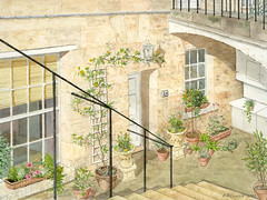
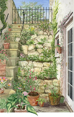
All this makes leads me to think about the colour sources we use when painting pictures. Some are purer and more reliable; others, less so. Upon reflection, I consider that the two best sources for colour are – the Mind, and the Real World. That is to say, your imagination or what you actually see. Depending on the subject and type of painting, either one of these would be the best bet. For myself, I have to say that my imagination is not as fertile as I would wish, and so making a sketch in ‘Plein Air’ is, ideally, the way I like to go. However, the limitations there are clear: the light is always changing, the weather may be inclement, and you may simply work so slowly as to make this impractical. So what’s next? Oftentimes you end up working from a photo, but this is third-hand colour at best. What I mean is, firstly, the camera interprets the colours. - Recently I was in a camera store, looking to upgrade my digital camera; (these days, you have to change cameras at more or less the same time interval as you change computers). With the bewildering numbers of choices on offer, I asked the manager for his advice. Well, he said, I like Nikon. Why?, I asked. I like the colour better, came the answer. That set me back for a moment. Until then I had not considered that different manufacturers, using differing technologies may end up presenting subtly different colours, depending on the algorithms used. That’s the first divergence. Next is the printer. It too has to measure the colours and values, and decide how best to reproduce them. Thirdly, the ink and paper selected will in turn present a slightly different and unique resultant print. Now you are looking at the print in order to copy it. What kind of light are you working under? Sunlight?, indirect daylight?, incandescent?, fluorescent? (I hope not!). By the time you lay the brush on the paper, you may be a long way removed from the original colour. You can shortcut some of these problems by working from an image on the computer monitor instead of from a print. I prefer this as next best to ‘Plein Air’, but it also presents problems. Is it convenient to paint where your computer is located?

But take heart. Finally, I am learning to trust my instinct, and gain confidence in my painting by constantly reminding myself that the picture is just a representation! In the end, it doesn’t matter which colours are chosen, so long as they provide a happy and recognizable result.

Whoa – thirty minutes already today? Heart rate is up; aerobic effect achieved. Time to climb down off the bike; go and have a shower.

Friday, January 18, 2008

Unexpected Paths to Meditation

Last summer I bought an exercise bike, at a garage sale, for thirty-five bucks. This was some little time after I had, (so pleased with myself), told my doctor how I was biking down the Niagara Parkway most days. “What are you going to do in the winter?’ he asked. For thirty-five bucks there were of course, no bells, no whistles, no computer on this device. Accessories, if you don’t count the basic speedometer/odometer, consisted of a simple kitchen timer. This thing has sat at the back of my studio, unused, reproaching me, for the last six months. Just looking at it filled me with ennui. How could anybody survive such boredom?
This morning I finally got on it, don’t ask why. I set the primitive brake adjustment so that I felt it a bit in my quads and buckled down. After what seemed like a fairly long time I checked my watch: two minutes had elapsed. Not so easily daunted as all that, and determined to get some good out of it, I pressed on. I thought to myself – I should build a kind of easel to hold a book, and clamp it onto the handlebars here; then the time would pass fast enough. I looked up. On the wall in front of me was a print of a watercolour of mine, that had been used as a calendar picture. July, it said. I studied the picture; traced the perspectives. I thought about summer. I thought about my route down the Parkway. Where would I be right now? I checked the odometer. Just about at the river. In my mind’s eye I saw the bright morning reflections off the water; such a lovely deep viridian. Why is that? Every river seems to have its own predominant colour. The Aare in Switzerland has a wonderful pale milky green shade. Glacial melt I guess. I pedalled on. My mind drifted into other paths. When the body is on autopilot it’ll do that. I thought about the painting I am working on now. Where should the sun be, in order to get the shadows just right? Perhaps I should darken those left hand side buildings.
I was getting warmed up. I set the brake a little harder; let’s go uphill for a bit.
I began to think about the book I have been reading, and my plans for the afternoon.

January is a good month for home redecoration. This year we’re tackling a bedroom. I’m still at the preparatory stage. Scrubbing down, sanding, removing old wallpaper. I’ve kind of settled into half a day of work on my watercolour, half a day of redecoration.
Once, when I was discussing, perhaps lamenting this business of home maintenance with my nephew, he wisely remarked ‘House painting is a meditative experience’. He knew, he’d done more than his share. But I thought, yes, you’re absolutely right, and ever since I have not begrudged that time spent so much, realizing that thoughts can be sorted and creativity can flower. Plans may be made; problems addressed. When you’re sanding walls, you’re pretty well on autopilot again, and the mind is free.

People often say they will go to sleep on a problem and wake up with the solution. It’s not exactly that way in my case. More that if I am wakeful my mind plays and roams and settles on some aspect of what I am doing during my days. Often there will be something yet unsolved – how best can I extract those rotten old concrete encrusted fenceposts? how should those dollhouse walls be fastened together. When the mind is not distracted by having to control the body it’s amazing how well it will work. I do indeed wake with the solution, and perhaps it is arrived at partly subconsciously.

There’s more paths than one up the mountain.

What time is it? Oh, twenty minutes already?. That didn’t seem so long. Some analysis, some synthesis, some conclusions reached. Unexpected.

I worked up a bit of a sweat there. Time for a shower.

Flickr, Friends, and the Balanced Life.

Flickr, Friends, and the Balanced Life.

I’m sure you’ve all been through this. You start on Flickr just to archive your pictures. Then you begin to meet people; people with the same interests. Well, they would be, wouldn’t they? All of a sudden you have friends out there. It just snowballs, doesn’t it? It’s not that you’re actively seeking out more ‘Contacts’, but somebody new comments, you look at their work, their profile; you say to yourself ‘I like this person, I want to keep in touch, see what they’re going to upload next.’

You started off uploading a few photos for half an hour the odd evening, now you’re on for two hours, three? Most evenings? Well, you like these people, you’re learning from them, you’re inspired. You’re enjoying yourself.

Yes, but with work, family, chores and everything else you just can’t fit in that much time for something new for the long haul. Something has to give, and generally it shouldn’t be work or family or all the other really important stuff. So the sad part is, the time comes out of your other hobbies; like the painting.

So this is for my ‘Flickr’ friends: I’m telling you this so that you’ll know and understand if I have to pull back a bit; if I can’t perhaps chat at such length or so often, or make as many comments. It’s not that I’m bored or tired of it, or you. Quite the contrary: I am stimulated and motivated as never before. And when I’m commenting, I like to think about that picture of yours that inspires me, and ask myself why do I like it so well. It tends to take a bit of time to figure out what I want to say in a comment.

So if I don’t respond to your comments in quite the same way, or address each one in the future, please know that I really appreciate hearing from you just the same. I’ll still be here, but I’ve just got to get everything into a proper balance.

Wednesday, January 16, 2008

The Purpose of My Blog - and 'Hello World'

Well now. I'm making some attempt to keep up with the modern world.

A few months ago I signed up to 'Flickr'. At first, my plan was merely to archive all my photos off-site, but I quickly discovered the pleasure of sharing and meeting others with similar interests. This in turn led to me posting increasingly long and sometimes only marginally relevant comments at the bottom of my own photos, in response to the kind remarks of others. In some cases, people have been curious about my techniques in connection with hobbies such as woodworking or card-making. It seemed to me inappropriate to enter into a long dissertation in the 'photo comment' format, so I felt a need for someplace like this where I can talk to (and listen to) friends (and relatives) around the world. So here I am.


This is beginning to cut into my painting time, so I will sign off. I look forward to exchanging news and views with my Flickr friends, and, who knows? maybe ...you.