Tuesday, March 23, 2010

Painting and Printing Decorative Borders


For the last little while I have been immersing myself in family history again. This included printing up a couple of family trees as gifts. These printouts are getting quite big and were looking rather plain. I thought this time I’d like to decorate them with borders and flower motifs, rather like an illuminated manuscript. I guess I was thinking about that Book of Kells. With the miracle of computers and home printing I was able to accomplish this a lot quicker than the mediaeval monks; nowhere near as well of course, but I had a lot of fun with it. I was partly inspired to do this because I recently bought a large format printer and can now print up to 13 x 19 inches; so when building a tree I only have to glue together half the number of sheets as formerly.

I began by painting in watercolour a long narrow band of mixed tree leaves and fruits; some traditional species from the English woods of my boyhood. Holly, ivy, ash and oak. At this time of year I can’t bring in leafy oak and ash twigs, so I did those from memory, but we do have both holly and ivy growing in the garden, so I brought in bits of that to refer to. I made that band about 18 inches long so that it would print the entire length of a piece of 11 x 17 paper. Then I painted a corner section along the same lines. These border bands are 45mm (about 1¾ inches ) wide.


Then I painted five small stylized wildflowers to go into the various corners. In accordance with my ancestry, I chose the thistle for Scotland and the roses of Lancaster and York to represent those two counties. I don’t know whether Cornwall has a national flower; but I always think of daffodils in the springtime down that way, so I picked that. Lastly, to represent the southeast of England, Essex and Kent, I chose the English bluebell which used to grow abundantly close by where we lived.

I scanned in the results, and with some rather tricky and careful planning I managed to print the border elements onto the sheets upon which I had already printed the family tree data. It helps to be able to flip the border bands horizontally and vertically in Photoshop, and of course, rotate them as required. This not only fools the eye into thinking the pattern is not repetitive, but also assists in achieving a good matchup when ‘splicing’ one page to the next. By this means I was able to print fourteen running feet of border whilst only having to design and paint about three feet.

I have uploaded everything freely on Flickr as usual, so if you like to download the pieces and play around with them you can make printed frames as I did. These illustrations can of course easily be made to print smaller than I painted them. They will probably look even better that way. When you need to ‘splice’ two lengths of the band together, or a piece of band to the corner section, proceed as follows: when you are dragging one of the various pieces into a new ‘canvas’ for assembly, first select the white background of the piece (with a low tolerance, say 10). Then select ‘Inverse’. Your selection now consists of the entirety of the painted elements without the white background. Now drag it over with the ‘Move’ tool and overlay it onto a previous layer. It will appear ‘lacy’ – you can see through between the leaves and twigs to the layer beneath. This enables a perfectly natural splice which will be absolutely undetectable. Merge the visible layers when all is in place and you are satisfied.

Sunday, January 10, 2010

Freeing it Up: How I’m learning to paint differently


I have been provoked into trying some radical departures from my usual style of painting, which as you, my friends, know, is generally deliberate, tight, and detailed. This is all very well, but I do often yearn to achieve a lighter touch. So when Bill and Gerry set up the ‘Flickr’ group ‘Fast and Fabulous’ and invited me to join, I was hooked. If I had to force myself to complete a painting in half an hour there would be no question of employing habitual techniques.

So today I broke out of the mould and did it. Perhaps once or twice in my life I have painted something in less than three hours, (the odd Christmas card, for instance) but this effort, ‘The Niagara River at Brown’s Point’, was painted in 28 minutes. Wow, you sure have to keep the brush moving fast!

I learned a lot from this new approach, the first thing being that you really should choose a simple subject. It helped that I had decided on a snowy landscape. Snow allows you to omit a vast number of brushstrokes. The next thing is, that it is good to internalize your vision to the point where you know exactly what you want to put on the paper; there’s little time now for reference to other sources for inspiration or detail. Better that it is already fixed in the mind. A couple of weeks ago I was driving down the Niagara Parkway, a very familiar route, and as I passed Brown’s Point the striking view through the trees imprinted itself on my mind: a broken sky of pure cerulean, seen through a tracery of sepia branches; the river cobalt green, glimpsed through tall hardwood trunks, mostly maple; a scattering of underbrush amidst the clean, fresh snow. It’s not convenient to stop at that point on the Parkway, and being the driver I could allow myself only a brief glimpse. A week later though, I came this way again, prepared to clarify and reinforce my impression of the scene. With only another two or three seconds to take in the scene, I am trying to train my powers of observation; this is fun in itself, seeing how much you can remember from only a brief instant of study; like Kim’s game.

From this mental picture I was able to plan my ‘order of work’. I had thought of first reserving out some treetrunk highlights, perhaps with vertical slashes with a candle-end, but dismissed this as unnecessarily fussy. So first I must lay in the sky and some violet shadows in the snow, wet-in-wet After the paper dried I would paint in the far bank of the river in a colour close to W&N ‘Neutral Tint’. Then I must broad-brush the treetrunks in sepia and add branches and twigs, next adding the bright flashes of the river, then finally some underbrush in Burnt Sienna. Figuring this out did take some thought.

The matter of colour selection took additional planning that I don’t usually pay much attention to ahead of starting on the picture. Again, simplicity had to be the keynote – little time can be devoted to mixing subtle shades of colour. I decided I needed only five shades - Cerulean Blue, Windsor Violet, Neutral Tint (with slight admixture of Ivory Black), Cobalt Green and Burnt Sienna.

Again departing from my usual technique, I made no preliminary pencil sketch; I just made two tick marks at the side of the page to register where I wanted the horizon and the river to be. As I entered upon the painting I got my next lesson: mix the paint strongly enough to achieve the required tone in one stroke. No time to build up the picture with careful layers. Ouch. I’ll do better next time; promise. The next obvious matter to be addressed is brush technique. Normally, I build my shapes up carefully with fairly small brushes. No time for that now. Broad-brush is essential, at least in many areas. Which brings one quickly to the realization that wielding a broad brush properly has to be learned: achieving the desired shape of brushmark with correctly delineated edges has to be accomplished in one swipe. Oh dear; I have to work on that seriously. Then there’s a question of detail; at the very least, it must be suggested, else the scene appear bland and empty of interest. I learned in this little trial to get some small delicacy in the underbrush by first putting on a little patch of colour with a No.6 round. then quickly feathering out the top of the shape by dragging a dry fan brush through it. I’ve hardly ever used this brush before.

I feel great satisfaction as I contemplate this process. The actual result matters little compared to the pleasure of learning so much in such a short time. Discovering too, that I can in fact produce a worthwhile sketch in very limited time opens vistas of possibility. No longer daunted by thinking I must set aside half a day if I am to paint at all, I begin instead to enjoy the happy thought that maybe I can find thirty minutes each day, like ‘Linfrye’, and might look forward to improving my skills with more frequent practice.

All of which brings me to some final thoughts, which are of gratitude for the inspiration and encouragement I get from my artist friends on ‘Flickr’. Were I on this journey by myself it would be lonely and often disheartening. Having in addition outsiders, (and not only friends), approve of work about which I myself entertain serious doubts gives a balanced perspective. Seeing, if only dimly, through others eyes is interesting.

So much, to come out of so little. Wunderbar!

Saturday, January 2, 2010

PERPLEXING PERSPECTIVE ~ or, Some Challenges Encountered in the Painting of an Interior Scene.


I decided to paint a picture of the Keeping Room in our house. I think this type of subject is an important one in art, yet it does not seem to receive much attention these days. Pictures of interiors memorialize important places and times in our lives. They show how we live and inform our descendants of this in an interesting way. This was powerfully brought home to me when last year I read a magazine article entitled “The Art of Intimacy”, written by Timothy Brittain-Catlin and published in ‘The World of Interiors’, October 2008 edition. The story reviewed an exhibition* of watercolours of Victorian era interiors and was profusely illustrated with fascinating reproductions which, when studied, tell us a great deal about a certain kind of lifestyle in those days. This article directly inspired me to attempt my first serious interior scene in watercolour – ‘View from the Parlour’, which you may see on my ‘Flickr’ site. Having achieved some success with that, this winter I began another view of our home interior.
I enjoy working in this genre for many reasons. As a (usually) slow painter it is helpful to have an unchanging scene which may be revisited as often as necessary, where the light may be examined at many different times each day, and where the comforts of home are close at hand. Another thing: we think that we have an intimate knowledge of all our possessions, but I discover that, speaking for myself, having to carefully study each element of a scene during the painting process gives an even deeper understanding and appreciation of each little treasure.

I set to work on my new project by making a couple of fast pencil sketches and ran into difficulty right away: I couldn’t get everything I wanted into the frame. From the west and south corners of the room I had to omit an essential key element - the fireplace; from the north and east corners the couch could not be included. This a basic problem when composing a ‘roomscape’. Just try to take a photo of any room and you will see what I mean. That is why real estate agents always have to use a very wide-angle lens. But then one quickly runs into distortions of perspective. Which is why I decided to write this blog.
The fact that I have not had the benefit of any education in art is a source of some regret to me. When I look at the works of others I can only envy their confident handling of composition and perspective. I am often frustrated by feeling that I have to reinvent so many wheels. Certainly, you may say that I can educate myself and learn from a wealth of available material, but I would sooner use the time I have to paint rather than study. So I struggle on. I soon came to the conclusion that I would have to somehow ‘unroll’ the room and play pretty fast and loose with the rules of perspective to get what I wanted; so in my mind I opened the room up as one would do by cutting down one side of a box (see Fig.1). I recognized an immediate drawback in this approach: the eye found insufficient differentiation at the centre corner of the design between the two ‘middle’ walls. It looked too flat. All four vertical wall corners actually needed more emphasis. The only way to achieve this was by adding curvature. All the walls could be regularly curved, (as in Figs. 2 and 4), but my mind was offended by the visual effect. There had to be distortion, but it must be hidden as far as possible. Which thought led me initially to ‘pinch’ the corners as shown in Fig.3 and in my rough sketch ‘An Illustration of Chosen Perspective’. This approach, by keeping the main part of each wall plane ‘flat’ or ‘straight’, would allow the elements of furniture all to be drawn in straight lines with more or less normal two-point perspective. The scheme did however produce a high horizon line. I wanted the horizon line to be at seated eye-level, about 48 inches above the floor, not only because this would make the scene easy to sketch from life, but also because it naturally best pleased the mind’s eye. I found a logical solution in Figure 5, which although it appears somewhat weird in preliminary layout, actually works quite well in the finished picture. My analysis is that it works because the areas of very large perspective distortion are irrelevant (as in the ceiling), or disguised (as in the foreground carpet), whilst the areas of minor distortion are hidden (the lower corners of each wall). Exceptions are found in the severe ‘bend’ in the carpet in front of the TV, and in the way the floor slopes down rather obviously from all points towards the viewer. I actually settled on this final composition and painted my watercolour prior to undertaking the in depth analysis of ‘why’ that I outline above. I had become curious to carefully explore various options, and borrowed a book on perspective from the local library as well. From this I learned several basic concepts about different perspective conventions that I had never been aware of: e.g. ‘circular’, ‘three-point’, ‘axonometric’ perspective, and so on. I drew the happy conclusion from this, that I was glad of my previous ignorance, in that it had allowed me to find a novel solution to my visual challenge outside of the conventional constraints that would have hedged my thinking had I been possessed of more formal knowledge. Ignorance, in this case was indeed bliss, or at least serendipity.

I hope you enjoy my work, and that it may interest you into exploring the wonderful world of interiors seen through the eyes of artists.


Here are two good places to look, that might fire your interest:

A group on ‘Flickr’ that I started recently called ‘Roomscapes ~ Paintings of Interiors’:

http://www.flickr.com/groups/1312692@N21/


The Thaw Collection at Cooper-Hewitt, National Design Museum:

http://www.cooperhewitt.org/EXHIBITIONS/fall-design/House-Proud/#images


* The exhibition referred to was entitled ‘House Proud: 19th-century Watercolour Interiors from the Thaw Collection’, and was mounted by the owners of this collection – Cooper-Hewitt, National Design Museum, N.Y., N.Y.

Thursday, October 29, 2009

In the Frame ~ Part Three


Some Decorative Ideas

Sometimes the frame made from a simple molding appears just a little too plain. I first wrestled with this issue when I was making new frames to display some paintings my grandfather had made some eighty years ago. I had added a linen covered liner frame and that really gave a good effect, but it was still just too quiet. I solved this by using a small rectangular grounding punch, as illustrated in (DSC02524).
A few years back, I bought some more decorative punches from my favourite tool store – ‘Lee Valley Tools’ – based in Ottawa. http://www.leevalley.com/ I put them to good use when I wanted to make a special frame for a two-hundred year old piece of silk embroidery, which had come down through my family. For this, I wanted to evoke the Regency era with some fine detail. I did this by first making a plant ‘stem’ along the molding by alternate shallow cuts with a carving gouge; (DSCN5498). Then I added little oak leaves and acorns with the punches. Feeling that the design was not yet quite full enough, I lastly added a sprinkle of little flowers. I did all this freehand. Don’t fuss with a measured layout. Trust your eye. This may look a little rough when studied close-up in a harsh light, but the final effect on the wall is exactly right. (DSCN5448, 5450).
I stumbled upon another method for making a frame more ornate when I acquired a number of lengths of decorative fillet (DSCN5528) I had been in discussion at the framing shop as to how best to display a rather special watercolour, and it was suggested that I use a double matt separated by a fillet. A selection of designs were brought out and we quickly agreed on a good treatment for the picture. But I then went on to muse out loud as to whether I couldn’t make these tiny moldings myself, and thought how they might be useful to dress up other frame moldings. The upshot was that I was offered a bundle of fillets left over from old projects in order to clear out useless stock. I chose one of these to enhance a molding design I had already used once in its simpler form; (the larger, gold coloured molding in (DSCN5470). Now, instead of running a rabbet on the inner edge, I cut a slot to receive the supporting side of the fillet. The underside of the decorated half of the fillet now provided the land for the picture; (DSCN5340). The finished result is shown in (DSCN5536).
Well now, that’s about it for the time being. In a future blog, I’d like to explain some tips and tricks I have learned for matting watercolours, prints and photos. I did not find the intricacies of this explained in the ‘How to’ books I consulted. I learned the basics from the owner of an Art Supply store, and more recently, some refinements from my Frame Store friend. That topic needs a bit of working up.
If you’ve read to the end here, then you probably intend to try out some of the ideas I have put forward. I hope that this little exposition will help you.

Mind your fingers!

Wednesday, October 28, 2009

In the Frame ~ Part Two


Gilding the Molding.

Disclaimer: I have no personal, professional or financial connection to any company or brand mentioned here. I have not received any gift, discount or other inducement from any source whatsoever. I pay retail price for all my art supply needs and tools. Where I feature a particular product, it is because I use it and it works well for me.

Having shown in ‘Part One’ how to make a picture frame molding, I am now going to describe and illustrate how to produce a metallic finish upon it, prior to making up the frame. This process can be used of course on a frame that’s already made up. I have accumulated a number of frames from garage sales, usually at about 50 cents apiece. It’s a good idea to strip the existing finish completely, otherwise make sure to give it a careful sanding so that the new finish will adhere properly.
The finishing is a four-step process: priming, undercoating, putting on a metallic paste, and finally varnishing. Make sure you have made plenty of molding for the size of frame you contemplate (DSCN5321). Run a minimum of 20% over your theoretical needs (50% is better). When making stock this way there will always be little anomalies that will show up during the finishing process, and it’s good to have lots extra so you can select the best. Also, you will find it difficult to reproduce the same frame molding so exactly as to match perfectly what you have already made. In my opinion, the best native wood for making framing is Basswood, called Lime in England and Linden elsewhere, but I find this increasingly difficult to find and expensive. My second choice is Eastern White Pine.
After sanding lightly, I prime the wood with an alkyd primer. The first coat of this will raise the grain slightly and leave a furry surface. Rub down with a worn piece of 220 grit garnet paper and if it needs it, apply a second coat of the primer.
Next is to put on a coloured undercoat, and this needs some thought (and a word of explanation). Because of the burnishing which is done after applying the final metallic finish, a certain amount of undercoat will show through; more or less depending on technique and the effect desired. (DSCN5364). It is therefore important that the colour of the undercoat is in harmony, not only with the metallic colour chosen, but also, to a certain degree, with the nature of the painting and the preponderant colours in it. For a rich, warm effect, a bright red undercoat with a reddish gold on top works well. Under a silver finish I might use black, grey, blue or green. You get the idea. (DSCN5109). For this undercoat I use everyday acrylic craft paint (DSCN5490). If you want a solid metallic finish, then don’t rub this coat down. The metallic paste will stick better to a slightly rough and porous surface; but if, for effect, you want to show a lot of colour through, then rub the undercoat down with a coarse cloth: the metallic paste won’t take the same grip
Now for the metallic coating. The product I use is called ‘Goldfinger’. It is a paste made by Daler-Rowney which comes in five different shades – Antique Gold, Sovereign Gold, Green Gold, Copper and (imitation) Silver (DSCN5491). Rub that on in accordance with the instructions (DSC02517). You can just use your bare finger, but I have lately taken to wearing a latex glove and using a cloth in order to try to protect my aging skin from solvents.
The instructions given with the ‘Goldfinger’ suggest that after the paste is dry (I wait overnight), you should buff up the finish with a cloth, but I have experimented with a harder burnishing and think I can offer a technique which will produce a finish more closely resembling metal foil . Instead of rubbing with a cloth, I employ homemade burnishing tools. The first ones I made were shaped from scraps of hardwoods such as ash and walnut (DSCN2834,5,6). More recently, I have been making burnishers from bone (DSCN5473). Shape them with files and sandpaper, polishing the working surface as finely as possible with 600 grit paper. Once in use, the burnisher will polish itself to a mirror finish. Traditionally, agate was used to burnish when gold leaf was applied over a gesso ground, so I bought a few little agate pebbles to try. They don’t work as well for the purpose, most especially because one cannot work them into a variety of concave shapes which is so easy with bone and wood.
So take a burnisher and gently, but firmly, rub it back and forth along the molding. By holding the work up to the light you will immediately see how a smoother, more polished surface develops. Don’t rub so hard as to remove too much of the gilt. By using tools of different concave and convex radii you can quickly achieve a polished metallic surface. Now finish off by buffing with a soft cloth.
The ultimate task is to varnish the burnished molding, using Daler-Rowney’s ‘Goldfinger Varnish’. This is one area where I have some trouble, and I should be grateful for suggestions to overcome it. The finish you have just achieved by burnishing is simply gorgeous; it cannot be improved upon. But the manufacturer does suggest overlaying a protective coat of their special varnish, made for the purpose, so I have been doing so. There are three problems with this. Firstly, the ‘Goldfinger Varnish’ is alcohol based, and so dries almost instantly. You have only time to lay it on with a full brush and sweep it once, maybe twice to ensure even and complete coverage. Then you have to stop as it will have stickied up. Secondly the flow of varnish tends to dissolve and remove your beautiful finish, so you have to employ a very gentle touch. Thirdly, the final result just doesn’t have quite the same rich sheen as an unvarnished piece. I am thinking that I should maybe not varnish a few frames now, and see how they hold up over a few years. Or else try a different varnish perhaps. Come on now. If you’ve read this far, help me out with a little experimentation and research.

In part three I’ll cover some ideas for decorating framing with special effects.

Tuesday, October 27, 2009

In the Frame ~ Part One.


Shaping a Set of Molding Knives.

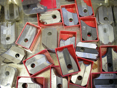
So let’s get down to business here. Making moldings. What I show may not be directly practicable to many, but it may inspire you to think about finding your own way to do framing, and I think it worth documenting, as a personal adaptation of woodworking techniques first developed in the mid nineteenth century, which gradually replaced those old wooden molding planes that you still can find in the antique shops. Every cabinet maker used to have his own collection of these. I’ve owned and used them myself, but long ago gave that up in favour of a Sears Craftsman three-bladed molding head, which will mount onto either a table saw or a radial-arm, which is what I have. This naturally does a far more even and accurate job in a fraction of the time. This is still available, and cheaply. Here’s what the set looks like. You can still get it from Sears for the same price I paid about thirty years ago - $99; (DSCN1714). - Please refer to my 'Flickr' site to see all the illustrations: http://www.flickr.com/photos/a_henwood/sets/72157614565091611/.
Disappointingly, Sears does not seem to sell the cutter bit sets separately any more as accessories, and neither could their parts department help. Fear not, however; all is not lost. There is a company called Corob Cutters - http://www.corobcutters.com/ - which offers an up-to-date molding head of the same type, and, they offer an extensive range of molding knives, which, (bless their hearts), also fit the Sears head. All this at most reasonable prices, so if you want to try this approach, and have a table or radial-arm saw, you can get into it without breaking the bank. If, on the other hand, you decide this particular approach is not for you, you can instead create a very respectable selection of mouldings using a router and some of the huge variety of bits on offer these days.
I have put my own personal stamp on framing by designing my own mouldings and then filing (by hand) sets of three cutter blades to reproduce the chosen profile. The first, and easy, step is drawing a profile, sometimes copied or adapted from one I have seen and like; (illus - ’Frame Designs 4’ - on 'Flickr'). For most watercolours I usually use a simple, slim frame moulding, for larger, more important pieces or oil paintings, I choose a wider, more ornate design.
Here’s how I made a matching set of three cutter blades to create the picture frame molding shown here : (DSCN5472). These are in High Speed Steel. In this example I start with the plain, square-ended ‘planer’ blade (DSCN1707 - 'Flickr'), though often I can save effort by modifying another ready made shape. The trick, of course, is to achieve the identical shape on each of three blades. This is not as hard as you might think. The task is made quite simple by using a stepped holder to carry the three blades at once, stacked together; (DSCN1705). The wooden holder is designed to support the blades with the bevels flush with each other, and is held in a vise so that these surfaces are level and ready to be worked on; (DSCN1708). Observe from this same illustration that quality control of the delivered cutters is pretty spotty: these three are supposed to be level and even! Remembering that the blades are going to cut at an angle of around 40ยบ, draw an approximation of the profile on the face of one of the blades; no need to do all three. We are not going to use computers or machine tools here, just files and maybe a grinding wheel or point in a Foredom or Dremel flexshaft. I prefer filing, as with grinding it is easy to overheat the metal and lose the temper of the steel; also it is harder to attain an even shape. There will be no precise gauging or measurements here: in the end the eye will tell all. A good selection of small files will do all the work; (DSCN1710). With the blades held as described, just start filing, taking care to keep the tool as straight and level as possible; attempting to cut, in the same pass, an equal amount from each blade. You won’t achieve this without a most important next step: after removing a reasonable amount of material it is time to shuffle the deck! By this I mean – unclamp the blades from the holder and change their order: e.g. if we say they were stacked as 1,2,3, then change that to 3,1,2 for instance. When you do this small discrepancies will show up, (DSCN1711) and you take these differences out with the next filing. Repeat this step from time to time as you progress. Because of the angle of the blade when it contacts the wood, the cut moulding will be shallower and less pronounced than the shape appears on the knife, that is, you must grind the knives to a slightly deeper, more exaggerated extent to achieve the desired cut.
When the knives approximate the shape you want, remove them from the holder and dress them individually with waterstones or oilstones; (DSCN1716).
Now it is time for a trial cut. Mount the cutter blades in the molding head and mill a cut on a short length of wood. You don’t need to cut more than a few inches. Unless you are extremely lucky, you will not be pleased with the result; (DSCN2022X). Note the double ‘tracks’ shown by the middle arrows. The upper and lower arrows point out that the sides of the molding, which should be evenly rounded, are anaemic or missing. The cutters are not registering together. The first thing to do is swap the blades around in the cutter head and run a couple more trial cuts to achieve the best result. Having done this, now mark the blades across the body or edge with a file, 1,2 and 3, according to the particular slot they fill in the molding head; (DSCN2053). (I have numbered the three slots on my molding head with a small punch). From here on, always mount the knives in their own same slot. Next, turn the head by hand over the trial cut and closely examine where each blade falls. Sometimes millscale is left on the base of the blade which interferes with properly square seating, or the blade may not in fact be cut properly square. This in turn may cause the entire blade to track slightly left or right of the others. This can be corrected by a little judicious filing of the base edge of the blade; (DSCN2054). Most of the discrepancies will by now have been taken out. What remains is small differences between the cutting edges of each blade. Turning the head by hand over the latest trial cut will reveal the reasons. Dismount each blade individually and file out the problem area. A final trial should now yield a perfect profile, but one yet marked by striations caused by the filing process; (DSCN2055). Polish these file marks out now using small slipstones; (DSCN5463). Your set of cutters is now finished, and should produce a nice clean stick of molding needing minimal sanding prior to applying a finish; (DSCN2486). The rabbet to hold the picture is easily run with dado blades, the stick ripped from the board, and the back edge of the framing smoothed on a jointer.
This may all sound like a terribly long, slow, involved process, but actually it is not. The methodical approach I have just set out will be just an interesting morning’s work, and the result will be a set of knives that will be useful for a lifetime.
There are ways to further decorate plain moldings. But I’ll get into that later on.

Monday, October 26, 2009

In the Frame ~ an Introduction.


This blog would be best read with reference to my pictures on ‘Flickr’, where the article will be fully illustrated. You can easily find a particular illustration since I refer below to the photos by number. Sorry I couldn’t figure out a way to enter them in the form of a concise ‘link’. All the relevant photos are together in a set called ‘In the Frame’. Here is a link to that set: http://www.flickr.com/photos/a_henwood/sets/72157614565091611/ The story is in three parts, which I hope to put up over the next few days. Here is an introduction.

The cost of having pictures properly mounted and framed can be a big issue. I have often heard the subject raised amongst artist friends. So it is natural that as an amateur artist myself and also a woodworker, awhile back I began building all the frames for my own paintings. As I gained experience in this, I have developed some techniques that might be of use to others, or at least of interest. I am illustrating my points on ‘Flickr’ in a new set entitled “In the Frame”.

Let me immediately reassure you that I have no intention of boring everybody by reiterating all the usual methods of frame-building that can be found in any of dozens of “How to…” books. Not at all. What I will set out is a narrow view of a few techniques which I have worked on over the past few years. This blog will be in three parts: firstly, a somewhat archaic and labour intensive way whereby I make my own picture frame mouldings; secondly, I’ll set out a really easy way to produce a fine metallic finish on those mouldings. Thirdly, a short section setting out some easy ways of enhancing picture frames with decorative touches.

Now I’ve told you what this is about, half of you may wish to tune out ~ that’s you artists who are actually selling your work. You are excused. If your work is good enough to find a consistent market, then maybe you shouldn’t be making picture frames. You may do better financially, and get more pleasure out of using the time to paint another picture. No, the people I’m talking to here are those like myself, who paint for their own satisfaction and find it hard to justify the expense of framing their work. I understand this even better now, since I recently went in to talk to my friend, the owner of a framing shop in the nearby city of St. Catharines. He told me that one of the frames I had just brought in to be glazed would cost roughly $400, framed and matted in the way I had done it. My total costs were roughly $50, thanks partly to him for furnishing me with matting, glass and foam core at reasonable prices.