Friday, September 5, 2008

A Couple of Weeks Study at the Flickr School of Fine Art.


It was August. It was all tomatoes, all the time. I was eating so many of them that I was dreaming about them. I woke in the night and thought about them. Pure delight, not only for the tastebuds, but for the eye too; and I don’t mean just the fruit. Sturdy vines snake upwards, branching at odd angles, helped here and there by a little support from bamboo stakes. Such beautiful shades of green in leaf and stem. Such interesting compound leaves; each little leaflet different, seeming to have a mind of its own; some large and deeply toothed, others small and rounded. Reaching up, trailing down; heading in all directions in happy chaos. What wonderful patterns of light and shade to be seen in the tangled jungly growth. Spherical glows of gold, orange and red peeking through the gaps. Unripe green globes hidden deep, awaiting their turn. I could sit and look at them for hours. In fact, I did sit and look at them for hours, since for the last many days I have been absorbed in trying to capture them in watercolours.

I wanted to keep in mind some of the lessons that ‘Gilmopix’ had tried to teach me: work with transparent colours, mix up your darks, learn to mix colours more from a limited palette. I started off doing a traditional landscape; well, gardenscape. That is, I drew the whole tomato patch with its regular ranks, in context; the context being our crowded little vegetable patch with the wheelbarrow leaning up hard by against the red-painted picket fence, the compost bin squeezed in on the left, retaining curbs and pathway in front. Behind this, (all too close) rises a huge multi-trunked maple tree. It’s a wonder we get any tomatoes at all, yet they seem to thrive here each year.

Before I had this little painting finished, I was dissatisfied. It was a nice scene, but a bit busy. The eye was pulled this way and that, along the fence all the way to one side, and back again. The sketch was full of potential interest, but perhaps unfocused, lacking a real focal point. Had I so quickly forgotten to incorporate “Gilmopix’s” excellent thoughts on how to place a centre of interest? I thought my rendering of the tomato plants a little hasty and slapdash too. I hadn’t really captured the leaves properly at all. I finished it off and thought about it. It didn’t actually look too bad, but quite soon the chief mistake struck me: I had painted what I saw, instead of my vision. Basic; elementary. But then, that’s where I am in my painting: learning some pretty basic lessons. Cursed with an analytic mind, I jotted down and counted up all the different elements in my picture. I made a total of eighteen definably different parts of the picture. I then turned my attention to my vision – what had I wanted to capture? Tomatoes – vines – leaves – stakes – fence. Five elements. All the rest was superfluous, much of it totally irrelevant. There was another thing I noticed too: the work lacked tonal punch where it mattered most – in the tomato patch. As an experiment I opened the scanned image in Photoshop and threw away the colour. In greyscale the central area of the picture now had little meaning: no proper leaves were discernable, and even the tomato fruits were irregular and hard to find.

I decided to take a little lesson from my Flickr friend, ‘Ciuccio51’. I ran off a print of the image, took a fine permanent ink pen and carefully outlined everything as far back as the fence. I added inked detail to the curbs and made a half-hearted attempt to draw some real leaves. The result was, in my mind, considerably better: the fruit now highlighted; everything in the foreground a little crisper, the background now in softer focus by comparison. I quite liked it.

But I decided I needed to start on a new tack, incorporating the lessons I had learned. I thought that this time I should begin with wet-in-wet, establish some bright fruits and lots of green wash. I wanted to take a lesson from ‘bevmorgan’, and try to achieve a good effect with negative painting upon flowing washes. I got the washes down – bright lemon, green, a little pink. I got that far and then I had to stop. I didn’t feel at all ready for the next stage. Actually, I don’t think I had been ready for the first stage. Too hasty; insufficient planning. Never mind; press on.


But now I thought perhaps I should do a tonal study first, so as to concentrate on a proper composition of the key elements, and to achieve a better representation of the leaves and fruit, without having to worry about colour at the same time. I had never done a tonal study before, but had come across the concept in some of my books on painting technique. I blocked out a very rough bare-bones sketch, outlining only a few tomato fruits, a stake, a couple of vine stems, and a suggestion of the fence. I wanted to try to draw more with the brush this time, rather than filling inside pencil lines with paint. I finally paid enough attention to the actual plants before me. I started painting leaves, and they really did look quite tomatoey. The whole thing came together fairly well, with the fun part being filling in the dark negative areas. I finished off with a thin wash of colour on the fruits only, which I thought set it off nicely. I learned more lessons on this one too: make sure you have a really really smooth curve on the outside of the tomato! Or they will end up looking more like potatoes. Oops! And don’t be careless with perspective on the fence, thinking that so little shows that it doesn’t matter. Amazing how the eye reads tiny discrepancies and says -“Wrong”.

I thought some more. I spent some productive time when I woke the next night: I put in an interesting hour or so meditating on how best to proceed with the colour version. It was too late to reserve any areas out, unless I wanted to begin again, so I had to come up with some order of work which would ensure a good composition. That did take some puzzling out. Obviously, I would first need to do a light pencil sketch over the existing washes. But what next? I came to the conclusion that the visible parts of the red fence should be put in first, because the colour here is so striking, that if I didn’t get a good balance of this right away I might lose it and be constrained later by the overabundance of vegetation. I worked out a sequence for the other parts of the picture and fell contentedly back to sleep.

Next day I was ready, eager and confident to get to work and see if the plan would work. I made a light sketch, taking special care over the alignment of fence parts and a proper angle for shadows on the exposed bits of earth. I very carefully outlined the tomatoes. Boy, is it ever hard to get a fair curve all the way around a fuzzy patch of yellow wash! Then I laid in some red on the visible bits of fence, to give a sense of where I was going. I tried with limited success to wash out the colour from where I wanted the bamboo stakes and put some colour there too. Hmm; would have been better to reserve that out in the first place. Now I was ready to paint the vegetation. It all went along pretty well after that.

I’m reasonably pleased with the result. There are lots of things about it to be dissatisfied with of course. No need to point them all out. I know that you, my teachers will recognize the deficiencies. I know too, that you will also be too kind to point them out, except upon request. That is as it should be, otherwise it could become just too discouraging. I’m still at the stage where I recognize enough flaws in each effort that I really don’t need any more pointed out at the moment. But I am thinking that that will have to change one day. If I ever get to the point where I think I’ve got it right, I’ll let you know – then you can all set me straight!

Thanks to all of you. I have mentioned only three of you in this little essay, but the rest of you know who you are. I am learning from all of you; all my teachers in the Flickr School of Fine Art.

That was a nice couple of weeks.

Saturday, August 2, 2008

A Different Approach with some 'Flickr' Postings


Whilst on holiday in Switzerland recently we enjoyed a wonderful mountain walk above Lauterbrünnen, and towards the end of the day, as we took the train from Kleine Scheidegg back down into the valley, we stopped off in the village of Wengen. We were browsing in a gift shop there when my attention was caught by some items in the postcard rack. There they had a number of fascinating reproductions of early Swiss travel posters. The originals dated from anywhere between the 1880s to the 1940s. I quickly selected eight or ten as souvenirs, mostly choosing those that illustrated places we had ourselves visited.

But there was one that I chose, not for location, but for the subject. I knew I had seen it before, in an old album of my father’s. It was a picture of an early Postbus, full of people, making its way along a mountain road with a background of lake and mountains. On the reverse of the card was mentioned that the poster itself was originally published around 1925.

And here is the personal link. In 1923 my father went on holiday to Switzerland, and being already a keen amateur photographer, he took a number of photos of his travels. He spent some time in the area of Montreux, (where he recorded a visit to Chateau Chillon), and ventured as far south as the St. Bernard Pass. He apparently travelled with a group, and one day they went by motor coach from Aigle to the Col du Pillon. On the way back their vehicle overturned on the way back down. Looking at the photo, one would imagine there must have been injuries, but this is not mentioned in the caption. All this I have gathered from the sequence of photos my father left, as I do not remember ever discussing with him his early travels; an omission I sorely regret today.

You may see from a comparison of the ‘Alpenposten’ poster and the photo my father took of the wreck of his tour bus, that the buses are very similar (though not identical) in design.

So now I have added a brightly coloured postcard to the family history revealed in the old sepia photographs. I intend to juxtapose some more old and new pictures to Flickr, which I hope will prove interesting. And if anyone can recognize anything in the old pictures, be it location, or make of vehicle, an interesting mode of dress, or any clue which might enrich the limited descriptions I am able to give, I shall be most happy to hear your comments.

Sunday, July 13, 2008

You again?

Woke up last night in the wee small hours. Lay there awhile, floating on the black sea of Unthink. Listening. Was it a car door? Voices? An early squirrel scrambling across the shingles? Tried to hear through the white noise of high frequency tinnitus for a signal. Got the regular surf of the blood coursing up next to my ears. Whoosh, whoosh, whoosh. Sixty a minute. Supposed to be rain tonight. Not yet. Nothing.

Listening again. Not with the ears this time. With the mind. Don’t need to go to the bathroom. What then?

Oh.

So it’s you. For fifty years I hardly knew you. Sure, we’d met. I found you interesting, at first. But then, you didn’t stay long. Funny really, when I think back to the time when it seemed you added a certain frisson to existence; I used you to embroider the odd short story of my life. Added a little piquancy. That was then. Get a little tired of your company these days. I’ve noticed your moods. I used to think that if I understood you better we might get along. I might adjust, learn to live quietly in your company. After all, even the unwanted guest has to be accommodated; somehow. Not that easy really. Why do you come now? I knew you would, but I’m never really expecting you. It seems an odd time to visit; but I’m learning; you have your schedule. Just when I thought I was getting a good rest.

Hello, pain.

Tuesday, July 8, 2008

Wildflowers, and the Perils of Identification thereof.


Just recently I was so powerfully affected by the beauty of the flowers in bloom in a wild meadow nearby, that I thought to myself - it's not too late, I should at long last take the time to find out some of the names of these little gems of nature. One of the loveliest was a little yellow flower, growing in great profusion and blanketing wide areas of the field. It was only when I got down on my knees for a really close look that I recognized the true wonder it offered. The flowers were borne in fat clusters about six inches long; but the individual florets were the tiniest things imaginable. Four of the smallest petals I have ever seen formed a tiny gold star, with room in the middle for just a couple of stamens, which somehow looked out of scale. There must be thousands of these florets on each cluster. The leaves of the plant were alike beautiful in their delicacy and brillian green colour. Little whorls of needlelike leaflets grew symetrically around the stem, and from the whorl another little stem would grow.

I came back to the meadow again and again. I took photos, I brought home samples of this and other plants. I went to my bookshelf and took down the long-unused Audubon Field Guide to North American Wildflowers, confidently expecting to find the flowers I sought clearly and unambiguously described and illustrated. Then I could properly title the pictures I had uploaded to 'Flickr'.

Ah, if only nature was so simple! To my astonishment, there appeared to be no flower in the manual that matched what I had. Despite diligent searching, I was reduced to calling this "Yellow Wildflower 1". I broadened my investigation. Surely, thought I, with all the millions of pictures on Flickr, someone will have illustrated my little beauty? Well yes; the pictures are indeed there, but they only come up if you already know the name, which, uh, didn't work for me at that time. Searching on "yellow, wildflower, cluster" didn't bring up a match. Not to be thwarted, I next searched for groups: two great groups for wildflowers came up on page one. And here a little serendipity came in. In the course of my search I also came upon a group called "ID Please". What a Godsend. Adherents of this group delight in the puzzle of identification, and within 24 hours of posting a photo of my treasure to the group I had my answer. The flower is called "Lady's Bedstraw" or 'Galium verum' to use its official moniker.

Or is it? It turns out there are possibly hundreds of species of 'Galium', and scores of Bedstraws within the group. I Googled. I Wikipeded. I have examined as many species as I can find, and there seem to be no similar candidates. Why take all this trouble? Because the yellow Lady's Bedstraw is apparently not supposed to live in Canada. It is European. It does not feature in the ROM Field Guide to Wildflowers of Ontario, which I have just taken out from the library.

Which raises the question - is this in fact the European flower, brought accidentally or intentionally to Canada? Or is it some rare variety too uncommon to have been included in the standard texts? I rather lean to the first option. Especially as this field is right next to Fort George, one of the first places in the area inhabited by Europeans. Did they bring mattresses? Did they shake out the old stuffing and unwittingly liberate seeds here. Or did some thoughtful immigrant carefully gather some seeds to bring, thinking not only how useful this plant would be, but how comforting it might be to have this reminder of home?

Where was I? Oh yes, put a name on a flower. Done that.

Saturday, July 5, 2008

The Meadow on the Commons


Last week I took my bike out and started riding out again, down the Niagara Parkway path. This pathway begins just at the east edge of town, and closely skirting Fort George, heads east to the river. The very first stretch of this route passes across the Commons just south of Fort George. The Commons consists of some hundreds of acres of field and woodland. The part that is now open grassland was used for decades as a military encampment, but now lies quiet, except for the odd equestrian event or military re-enactment. Most of the grassland is mown a few times a year, but a patch bordering the woodland towards the river has been left as a natural meadow. As I passed by early last week, I was struck by the wonderful display of wildflowers. The growth was riotous. There were great swathes of different species, blue, pink, purple, mauve and yellow. I got off my bike and made my way through the long grass to the edge of this glorious field. I was quite transfixed. I stood and studied the scene for a while. Not being a botanist, I cannot tell you (yet) the names of all the lovely flowers that carpeted the landscape. Perhaps with the aid of the photos I have posted on Flickr, some kind person will help me with their identification. They are not rare, and I am surprised that, although I consulted my copy of the Audubon Society Field Guide to North American Wildflowers, I was still unable to put a name to any except the Chicory and the Milkweed, both of which I already knew.

The next day I took along my camera and took numerous shots of the area, including some closeups of the flowers and others showing the context of how they grow. I was struck by how the patches of each flower in its thousands formed bands of colour, receding towards the woodland edge. When I got home I examined my photos, and felt frustration and disappointment that somehow I hadn't captured the wonder of it all. I went back several times, even bringing home some samples of the flowers and their leaves and stems, determined to find out what they were.

I realized there was potentially a lovely painting waiting for me here and I soon felt urgently that I should try to capture the scene before nature changed its clothes once more.

So this morning I put my sketchbook and some paints in my saddlebag and set out once more. It was a beautiful day, all day. The sun shone brightly and the air was clear, giving hard edges and a vibrancy to the colours which I hadn't seen before. I had a wonderful time. I stood in the field, painting, for about an hour and a half before I was done. And the great thing was this: I knew that here I had a view which was inherently free; free of any requirement for symmetry, or particular shape. It consisted of bold patches of colour in random shapes and sizes, sometimes flowing one into the other, sometimes showing a natural layering one on the other as they marched into the distance. Spiking up here and there were scores of milkweeds with their pink pom-pom flowers, and the occasional shrub and sapling added interest. There was nothing at all which said "I have to be here, and shown exactly like this!" So, I thought, here's the best chance I'll have to break away from tightness and careful drawing. I decided, for the first time ever, that I would not make a drawing, that I would use no pencil. Usually, I feel a certain fear when beginning a painting, that it won't work out the way I hope; that I won't realize the vision. Today I told myself that I had little need to worry, just so long as I faithfully set out the colours. And so it proved. I am rather happy with this one.

Tuesday, January 22, 2008

Perspective, Artistic Licence, and the Limitations of Photography.

I am intrigued by unusual perspectives. I'll illustrate using a couple of my paintings. To see the full size versions, please visit my Flickr page.

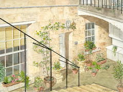
Courtyard Flat, Bath

This watercolour is entitled "Courtyard Flat, Bath'. In my Flickr description, I say'.....the perspective challenge interested me: when viewing the scene it is actually impossible to get all the elements shown into the picture at once photographically, without distortion'. This statement was quite legitimately queried, and here is the answer:
Notice the railings at the top right, over the jack arch. These railings continue around the front, along the sidewalk edge, in front of the basement well. Note also that the visual horizon is (more or less) exactly at the top edge of the picture. So, to get this picture without those railings would mean poking your camera between them at about two feet above the ground, and then you'd have to use a very wide angle lens to include the window on the left and the white cupboards on the right. Another thing is the sunshine illuminating the scene, which is just as important. To get the sun to shine in at this angle, first, you'd have to demolish a whole row of historic houses on the other side of the street. And then, you'd also have to shift geographically, which is better explained using a second painting. If you compare this picture with photos of the same scene (found in my ‘England’ set), you will see what I mean.


Here is another painting from Bath, in southwest England; latitude, about 52º north.

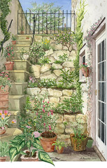
Pamela's Garden
The picture is called 'Pamela's Garden'. In this case, you could more easily reproduce the scene itself photographically, although I have taken some small artistic liberties to improve the composition. But that, in this case, is not the point. The photographic impossibility here is the light. Here, we are in fact looking to the west. To our left, the high wall seen in the top left of the picture extends right along to join the back wall of the house. The top would be perhaps eighteen feet above the courtyard floor. The sun begins to light up the courtyard just after noon, but doesn't truly shine in until much later in the day. Note the shadow cast by the top of the wall on the steps. See how high the sun is. Even in midsummer, it is impossible to have this much sun. Remember, we are in a latitude of 52º; (that's equivalent to being around the southern end of Hudson's Bay, to those of you who are not geometrically minded). To get this sunshine you'd have to be at least as far south as the Bahamas, say around 35ºN. I took similar (though less extreme) liberties with the sun when painting 'Courtyard Flat'.

Right now I am working on another perspective challenge. This one is more difficult still, as there are curved buildings involved, and the best vantage point to get the composition I want would be approximately 30 feet above the sidewalk. I lugged an aluminum stepladder to the scene so as to get as high as I could, then held a camera over my head to take reference photos, but that only brought my observation point to about ten or twelve feet above the sidewalk. I am still having to create in my mind the higher perspective that I need. A photographer will find something magical in an everyday scene and lead us to see it; but even the greatest photographer would be unable to capture this view in the same way.

Saturday, January 19, 2008

On Colour and Values in Painting

WARNING:
To anyone who has been to Art School, or been involved in fine arts for a while this will probably be old hat. Read no further. You must excuse me. But for those of us who are self-taught, haven’t yet achieved much, and are groping our way towards an understanding in this discipline, matters of colour, hue, shade and value need exploring. I find that putting my thoughts on paper helps me. Whether it is helpful to others is open to question.

I climbed onto my exercise bike again today and started off.

‘What shall I think about today?’ I asked myself. Wrong. Well, … actually, there’s nothing wrong about choosing a subject and thinking about it. The process will most likely lead to a workmanlike solution to whatever the problem was. But that isn’t what I’m after. I don’t have a particular problem or research topic that needs addressing in that way. I’m anticipating,… what? The insights that sometimes come when the mind is free. Was yesterday just a one-off? I think maybe the Buddhists have it right; the trick is, to empty the mind.

It’s windy today; and bright. Partly cloudy. I look out the window. The sun is going in, coming out; playing with the colours. The wind is from the southwest and strong; must be a cold front on the way. Zero at the moment, it’ll probably be colder later. The air is crystal clear.
When the sun is out, the colours are perfectly saturated, when it goes behind a cloud the colours are not just darker, they are duller. And the colour of the shadowed boards under the eaves of my neighbours house is not the same hue as the boards lit by the sun. Why is that? It occurs to me that this de-saturation has basically just a straight inverse relationship to the amount of ambient light. At night, everything is in greyscale, black, grey and white. You can easily explore the effects of desaturation in ‘Photoshop’. Open any picture in this program, and then click on the ‘brush’ tool, or the ‘paintbucket’ on the toolbar at the left side Now pick up a nice colour from your photo by clicking the mouse with the ‘Alt’ key held down. This colour will show as ‘Foreground’ colour in the little square. Now click on that square to ‘Choose Foreground colour’. This will bring up a small page, with your colour marked by a little circle. Drag the little circle straight up towards the top of the page (totally saturated) or straight down towards the bottom (totally desaturated). Notice in the ‘selected colour’ window, how the hue has actually changed. I am trying to figure out why this is. Going back to the shaded board versus the sunlit ones, partly it must be because the sun is lighting up the bright boards with a unique spectrum, or mixture of light wavelengths. The shadowed board, on the other hand, is lit by light reflected from other surfaces, (clouds, buildings) or light from the ‘blue’ sky. So the end result, light finally reflected into the eye of the beholder, is actually a reflection modified from a quite different spectrum. So it makes sense that the perceived colour should change I suppose. But then again, 'Photoshop' doesn't know the unique conditions in which this colour is presented, so there must be more to it than that.

Colour is not as solid, real and defined as I used to think. It’s partly subjective. Different people see colours differently. Even the same person can see colours differently. I learned this one night when I was flying a 767 over the Atlantic. Sitting quietly in the dark, the First Officer an indistinct shadow beside me. Checking the instruments, making position reports; steadily proceeding towards Europe. The lights turned low, so we’d notice anything outside, untoward or not; the cockpit bathed in a soft reddish glow from the instrument lights. One of the instruments, a distance measuring device with LED readout, was a little brighter than the others. It caught my attention as being different. How different? Something about the colour. I studied the numbers. What was it? I looked away, to one side, as I had been doing when I first noticed the difference. The colour changed! I looked back; it reverted. I closed one eye and looked – the light was red. I opened that eye and closed the other. The light was orange! I was getting two distinctly different colour interpretations of the same thing! Very strange. This condition did not present any difficulty, nor was I particularly worried about it. The anomaly stayed with me, on and off, several years. When I would wake up in the morning, the bedpost would appear reddish-brown through one eye, yellowish brown through the other. Now remember, I was a pilot. My eyes were regularly checked, including a test for colour vision. I never had any trouble interpreting the colour charts and reading the numbers. I have perfect colour vision. But? My wife will often see something as a brown colour, that I see as a shade of green; (this in connection with the colour of my trousers). I am merely illustrating here that colour can be interpreted differently. It is not simply a matter of wavelength; it has, for want of a better word, flavour.

Now value; that’s something else, and just as difficult sometimes. Is the blue sky lighter or darker than the sunlit building? Sometimes I really struggle with that. No matter how much I narrow my eyes and squint, I find it hard to decide. Somewhere I read, or heard, the suggestion that the artist should try to assign a lightness/darkness value to each component of their painting on a scale of one to ten. This makes sense, but is again often harder to assess in practice than in theory. Here again, ‘Photoshop’ can come to the rescue. Open a picture and ‘Remove Colour’ so you can see it in greyscale. That’ll tell you.

All this makes leads me to think about the colour sources we use when painting pictures. Some are purer and more reliable; others, less so. Upon reflection, I consider that the two best sources for colour are – the Mind, and the Real World. That is to say, your imagination or what you actually see. Depending on the subject and type of painting, either one of these would be the best bet. For myself, I have to say that my imagination is not as fertile as I would wish, and so making a sketch in ‘Plein Air’ is, ideally, the way I like to go. However, the limitations there are clear: the light is always changing, the weather may be inclement, and you may simply work so slowly as to make this impractical. So what’s next? Oftentimes you end up working from a photo, but this is third-hand colour at best. What I mean is, firstly, the camera interprets the colours. - Recently I was in a camera store, looking to upgrade my digital camera; (these days, you have to change cameras at more or less the same time interval as you change computers). With the bewildering numbers of choices on offer, I asked the manager for his advice. Well, he said, I like Nikon. Why?, I asked. I like the colour better, came the answer. That set me back for a moment. Until then I had not considered that different manufacturers, using differing technologies may end up presenting subtly different colours, depending on the algorithms used. That’s the first divergence. Next is the printer. It too has to measure the colours and values, and decide how best to reproduce them. Thirdly, the ink and paper selected will in turn present a slightly different and unique resultant print. Now you are looking at the print in order to copy it. What kind of light are you working under? Sunlight?, indirect daylight?, incandescent?, fluorescent? (I hope not!). By the time you lay the brush on the paper, you may be a long way removed from the original colour. You can shortcut some of these problems by working from an image on the computer monitor instead of from a print. I prefer this as next best to ‘Plein Air’, but it also presents problems. Is it convenient to paint where your computer is located?

But take heart. Finally, I am learning to trust my instinct, and gain confidence in my painting by constantly reminding myself that the picture is just a representation! In the end, it doesn’t matter which colours are chosen, so long as they provide a happy and recognizable result.

Whoa – thirty minutes already today? Heart rate is up; aerobic effect achieved. Time to climb down off the bike; go and have a shower.